Ever come so far and then hit a bump or a road block? Does it ever make you want to stop and find a different path? What makes the path the wrong one?
Every day I have to keep looking towards my goal. I have been side tracked, sidelined and ready to quit. But 100 % it is a mental game and I have to keep focusing on the future I want.
I worry everyday that I am not making the right steps or taking the right turns. I worry that I cant see what is in store. I worry that I am not tough enough mentally or physically to make it happen.
But I know I am a stubborn person. I know what I want. I know I’m not going to give up. So the future should worry about me!!
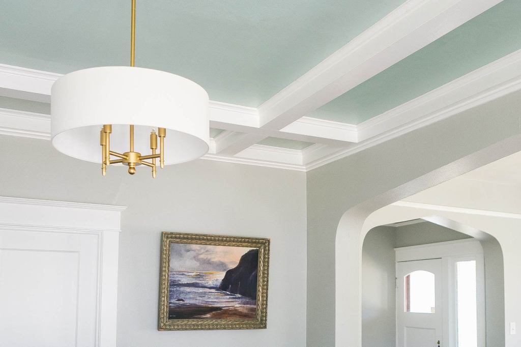
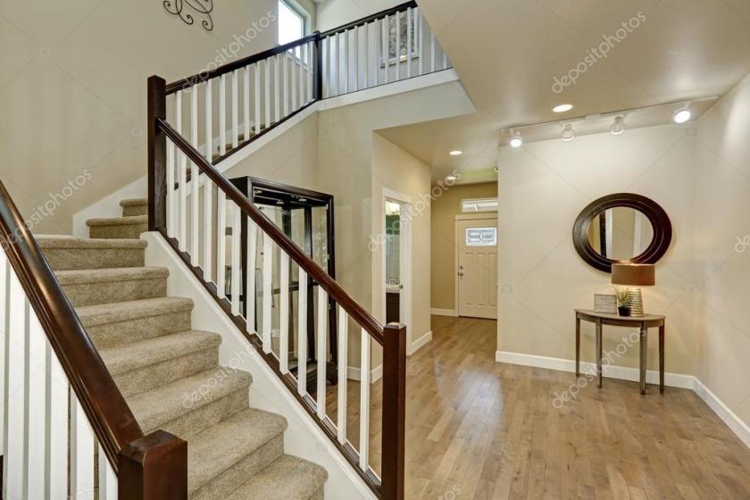
Colored ceilings play a pivotal role in shaping the mood and perception of space within a room. A well-chosen ceiling color can dramatically alter the ambiance, adding a unique dimension to the overall design. Darker ceiling colors, such as deep blues or rich grays, evoke a sense of coziness and intimacy. These colors can create the illusion of a lower ceiling, making a room feel more enclosed and snug. This effect is particularly beneficial in larger living spaces or bedrooms where a more intimate setting is desired.
Conversely, lighter ceiling colors, including soft whites or pastel shades, contribute to a feeling of expansiveness and airiness. These hues can visually lift the ceiling height, opening up the space and making it appear larger and more inviting. This approach is especially effective in smaller rooms or areas that lack natural light, such as kitchens or bathrooms. By choosing light, reflective colors, the ceiling can help bounce light around the room, enhancing brightness and a sense of space.
The selection of ceiling color should be thoughtfully considered in relation to the room’s function and the desired ambiance. For instance, in a living room, a warm, inviting color on the ceiling can create a welcoming atmosphere, while a light, airy color might be more suitable for a kitchen where cleanliness and openness are paramount. Bedrooms, often a sanctuary for rest and relaxation, benefit from calming, subdued ceiling colors that promote tranquility.
Different color choices can transform the atmosphere of various types of rooms. Experimenting with ceiling colors allows homeowners and designers to craft spaces that not only meet functional needs but also enhance aesthetic appeal. Whether aiming for a cozy retreat or an open, airy environment, the ceiling’s color can be a powerful tool in achieving the desired ambiance. This nuanced approach to color application underscores the importance of viewing the ceiling as a critical element in interior design.
Coordinating Ceiling Colors with Furniture and Decor
Choosing the right ceiling color to complement or coordinate with your furniture and decor is essential for creating a harmonious and cohesive design. The ceiling, often referred to as the “fifth wall,” plays a pivotal role in the overall aesthetic of a room. By carefully selecting a ceiling color that either matches or accentuates the existing elements, you can significantly enhance your space.
One effective approach is to use color theory as a guide. Understanding the relationships between colors on the color wheel can help you make informed decisions. For instance, complementary colors—those directly opposite each other on the color wheel—can create a dynamic and balanced look. If your room features a lot of blue tones, a soft orange ceiling might provide a beautiful contrast while maintaining harmony. Conversely, analogous colors, which are next to each other on the color wheel, offer a more subtle and cohesive look. Pairing a green ceiling with blue and teal decor can create a serene and unified space.
Contrast is another critical factor to consider. A bold ceiling color can serve as an accent that ties together various decor items or furniture pieces. For example, a deep navy ceiling in a room with white walls and dark wood furniture can create a striking focal point, adding depth and sophistication. On the other hand, a more neutral ceiling, such as a soft gray or beige, can provide a subtle backdrop that enhances the overall aesthetic without overpowering the space. This approach works particularly well in rooms with vibrant or patterned decor, as it allows the other elements to shine.
Creating visual balance is key to a well-coordinated space. If you opt for a bold ceiling color, it is crucial to balance it with other elements in the room. This can be achieved by incorporating accessories, textiles, or artwork that echo the ceiling color. For instance, if you choose a rich green ceiling, adding green throw pillows, rugs, or wall art can help create a cohesive look. Conversely, a neutral ceiling gives you more flexibility to experiment with colorful decor items and furniture without overwhelming the room.
In summary, coordinating ceiling colors with furniture and decor involves a careful balance of color theory, contrast, and visual balance. By considering these factors, you can create a space that is both visually appealing and harmonious, transforming your room from above.
Beyond Paint: Creative Ceiling Treatments
When considering how to transform your space from above, the use of color on ceilings extends far beyond traditional paint. Creative ceiling treatments can redefine a room, adding texture, dimension, and a unique focal point. One such innovative approach is the use of patterned ceiling tiles. These tiles come in a myriad of designs, from intricate floral motifs to geometric patterns, offering a sophisticated touch that paint alone cannot achieve. Patterned ceiling tiles can introduce a sense of elegance and visual interest, making them an excellent choice for spaces that aim to impress.
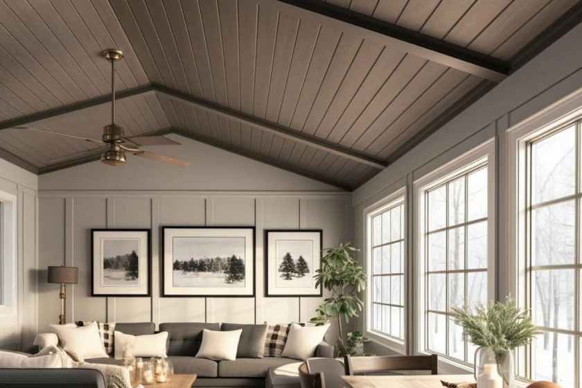
Another compelling option is shiplap, which brings a rustic charm and depth to any room. This wooden board treatment, commonly used in farmhouse and coastal designs, adds warmth and character through its natural texture. Shiplap can be painted in a variety of colors to match your decor, or left in its natural state for a more organic feel. The horizontal lines of shiplap also draw the eye across the ceiling, enhancing the perception of space and making rooms feel larger and more open.
Incorporating color as a backdrop for stunning lighting fixtures or exposed wooden beams can further elevate your ceiling design. Colorful ceilings can make chandeliers, pendant lights, or even recessed lighting pop, turning these functional elements into striking features. Exposed wooden beams, whether they are structural or purely decorative, can benefit from a contrasting ceiling color that highlights their natural beauty and craftsmanship.
These creative treatments showcase the potential of ceilings as more than just a blank canvas. By exploring options like patterned ceiling tiles, shiplap, and strategic use of color with lighting and beams, you can transform your ceiling into an integral part of your interior design. These ideas not only enhance the aesthetic appeal of a space but also inspire a sense of creativity, encouraging you to think beyond the conventional use of paint.
Choosing the right wallpaper can transform any room in your home, but with so many options available, it can be overwhelming to decide what fits best. Whether you’re looking to create an accent wall, establish a theme, or make a bold statement, this guide will help you make an informed decision. Let’s dive into some practical tips to assist you in selecting the perfect wallpaper.
Accent Walls: Subtle Yet Impactful
If you’re considering an accent wall, you’re aiming to highlight a specific part of the room without overwhelming the entire space. Accent walls are perfect for hanging art or adding shelves, so choosing a patterned or textured wallpaper is ideal. Patterns like geometric shapes or subtle textures can provide a versatile backdrop that complements various decor items, giving you the flexibility to change up the room’s look without replacing the wallpaper.
Themed Walls: Bringing Cohesion to Your Space
Themed walls are a great way to bring a sense of unity to a room. Themes could range from classic stripes and floral patterns to more specific designs like kitchen utensils in the kitchen or soap bubbles in the laundry room. When choosing a theme, think about what makes you happy and how you want the room to feel. Themed wallpaper can create a cozy, cohesive atmosphere that reflects your personality and style.
Statement Walls: Bold and Beautiful
For those who love to make a dramatic impact, a statement wall is the way to go. Statement walls can be created using wallpaper murals, vibrant patterns, or pops of color and shapes. These are perfect for adding a focal point to a room and can be a great conversation starter. However, due to their bold nature, it’s essential to ensure the design complements the rest of the room’s decor.
Practical Tips for Choosing Wallpaper
Most wallpaper options can be ordered and found online, making it easier than ever to browse different styles and designs. Before you make a purchase, consider your DIY skills. Some wallpapers, especially one-run murals, require precision and leave little room for error. If you’re not confident in your ability to hang the wallpaper yourself, it might be worth seeking professional help to ensure a flawless installation.
Have Fun with Your Choice
Remember, choosing wallpaper should be a fun and creative process. Don’t be afraid to experiment with different patterns and colors until you find what truly speaks to you. After all, your home is a reflection of your personality, so let it shine through in your choice of wallpaper.
What I mean by parachuting is keeping an open mind to learn new things, try new things and experience new things. I have heard this quote several times and I still like it because I am passionate about personal growth and building.
We have a short time in this life to grow and explore. This world however has so many unique places and offers so many ways of life. One person could never experience them all even with ten life times. My goal is to get as much out of it as I can with what time I have.
That doesn’t mean that I am always on a plane, in a boat, riding a train to whatever stop is next. I am still working on that luxury but while I dream of those places I read about them and learn about different people. Experiences arent limited to places. A stranger can show you something that might inspire you, a conversation change your mind or opinion, teach you something new.
We are taught the beliefs and habits of our parents, friends and family that surround us. Having an open mind also means being open to how others live their lives or their beliefs. I have had many conversations that have had profound effects on me because I received a different perspective from a trusted friend. I have learned new ways how to work, how to build trust and relationships, how to communicate better.
Catching new ideas and expanding on the skills and qualities you have will allow you to fly higher. Pun intended. Don’t limit yourself to what you know or what you think you are capable of. Open your mind and let in the possibilities. Why do the same thing for the next fifty years when you can have a new experience everyday!
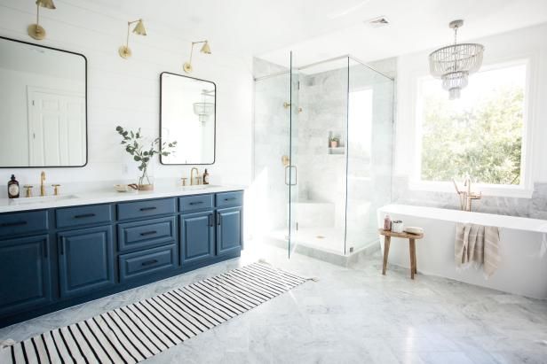
One of the key elements to creating a light and airy master bath is to make the most of the natural light you already have. If your bathroom has windows, consider using sheer curtains or blinds that allow light to filter through while still providing privacy. Natural light can make a space feel larger and more inviting, so don’t block it out.
Incorporate Cool Lighting Hues
In addition to natural light, incorporate cool lighting hues with your fixtures. Opt for LED bulbs that emit a soft, white light rather than harsh, yellow tones. This will help to enhance the airy feel of your bathroom. Fixtures in chrome or brushed nickel can also reflect light and add to the overall brightness.
Add Mirrors
Mirrors are an excellent way to make any space feel larger and more open. In a master bath, consider adding a large mirror above the vanity or even a full-length mirror on one wall. Mirrors reflect light and give the illusion of more space, making your bathroom feel airy and light.
Choose Simple, Free-Standing Tubs
To avoid making the space feel heavy, opt for simple, free-standing tubs. These tubs take up less visual space and keep the bathroom feeling open and uncluttered. They also add a touch of elegance and sophistication to the room.
Go for Neutral, Light Colors
When it comes to color schemes, neutral and light colors are your best friends. Whites are clean and bright, making the space feel fresh. Greens and blues are calming and give off a spa-like vibe. Stick to these colors for walls, tiles, and even towels to maintain a cohesive and airy look.
Consider Cabinet Size and Quantity
The size and quantity of cabinets can greatly affect the feel of your master bath. Floating cabinets or cabinets with feet will feel lighter and less bulky. For a brightening effect, choose white cabinets. If you prefer a bit of contrast, go for deep colors such as navy, ash, or black. This can add depth without compromising the light and airy feel.
Final Touches
Finally, add some finishing touches to complete the look. Plants, for example, can add a touch of nature and freshness to your bathroom. A well-placed rug or a set of plush towels can also enhance the cozy, spa-like atmosphere you’re aiming for.
By following these tips, you can create a master bath that is not only light and airy but also a relaxing oasis where you can unwind and rejuvenate.
No matter what I have going on I will make it a priority to go for a pedicure. Not because I have ugly toes but because for an hour or so I can just relax and enjoy. The pretty colors are a bonus of course. LOL Also its not a crazy expensive luxury but it does make you feel a little spoiled.
I truly believe that we need to take time out of our busy daily lives to take care of ourselves. We spend so much time thinking about work and chores, life and family but how often do we think about the things that make us happy or relax?
I schedule an hour for me every 3 to 4 weeks. I dip my toes in the water and turn on the chair massager. I may take friend or I may just chill with my headphones in. Never wanting to be rude though I make sure my nail tech does or doesnt want to talk. Some times they do 🙂 I love the heated towels and the massage. If you havent tried it I highly recommend.
Utilizing Existing Base Colors and Adding Secondary Colors for Different Zones
When considering repainting your home, it’s essential to recognize that you don’t need to update every wall if the color is neutral and the paint is in good shape. A more strategic and often cost effective approach involves keeping the neutral base colors in common areas like living rooms, kitchens, and hallways. This method creates a cohesive and calming environment that enhances the flexibility of your decor and furniture choices. Many times neutral colors, such as beige, gray, or soft whites are found for new construction homes, acting as a versatile canvas, allowing you to easily adapt the space to different styles and trends over time.
Neutral base colors in common areas help in establishing a unified look throughout your home. These shades serve as a backdrop, seamlessly connecting different spaces and providing a sense of continuity. This consistency makes your home feel more spacious and inviting, as the flow between rooms is less jarring and more harmonious. Additionally, neutral tones are known for their ability to make spaces appear larger and airier, contributing to an overall sense of tranquility.
To add depth and interest, consider employing a secondary base color for specific zones of the house. For instance, you might choose a distinct yet complementary color for hallways, different wings, or upstairs areas. This approach not only saves time and resources but also helps in defining different areas within the home. By using secondary colors strategically, you can create visual boundaries without overwhelming the overall aesthetic. This method allows each zone to maintain its own character while still contributing to the unified look of your home.
In conclusion, the strategic use of neutral base colors in common areas combined with secondary colors for specific zones is an effective way to refresh your home. This approach balances cohesion and individuality, ensuring that your home remains inviting and adaptable. By carefully selecting and applying these colors, you can achieve a harmonious and well-defined living space.
Customizing Rooms and Special Spaces with Unique Colors
When it comes to individualizing spaces within your home, the strategic use of unique colors can make a significant impact. Common areas like living rooms, hallways, and kitchens often benefit from neutral or secondary base colors, creating a cohesive and versatile backdrop. However, personalizing the color schemes in specific rooms can enhance both aesthetics and functionality.
For instance, the master bedroom and bathroom are ideal spaces for personalized color schemes that promote relaxation and retreat. Soft, calming hues such as blues, greens, and lavenders can create a serene atmosphere, making these areas an oasis within your home. These colors can be complemented with neutral undertones to maintain a sense of continuity throughout the house.
In contrast, dining rooms and home offices can be painted with colors that stimulate appetite or boost productivity. Warm tones like rich reds, warm oranges, and deep yellows are known to enhance dining experiences by making the space feel inviting and lively. For home offices, shades of blue and green can foster concentration and reduce stress, creating an environment conducive to productivity.
Children’s rooms, particularly shared spaces like Jack and Jill bedrooms, present another opportunity for creative color use. Maintaining a neutral base color with the addition of an accent wall can strike a balance between playfulness and harmony. Vibrant colors like cheerful yellows, playful pinks, or energetic blues can be used on accent walls or in decorative elements to reflect the personalities and preferences of the young inhabitants, all while ensuring that the overall design remains balanced and cohesive.
This method of customizing rooms with unique colors allows for personal expression while upholding a harmonious flow throughout the entire home. It demonstrates that repainting does not necessitate painting every wall, but rather, making thoughtful color choices that cater to the specific needs and functions of each space.
Sometimes I just have to get my thoughts out of my head and on to paper so to speak. So much is changing fast with me and in a very positive way. The pros say that you shouldn’t share your plans with the people around you, you should just get to work. And for the most part, that is what I do. I put my head down and get to work but things are going very well and I wanted to share for those who may be just getting started or are going thru the “is this going to work?” phase.
I really started to work on myself as a person, a worker, a leader last spring when I had hopes that I would be going into management for Sherwin Williams. I took a long hard look at where I wanted to be, what was standing in my way and what I needed to do/achieve to get there. As it turns out, hoping to go into management pushed me into an entirely different path.
As part of self discovery, I realized while still attempting to advance with Sherwin, that it had run its course and was holding me back from what and where I need to be. There was no position with the company that would make me complete or make my dreams happen. I figured out that I have more to offer and value myself higher than the hourly position I was working. Once I came to terms with it not being my life’s calling everything has shifted.
Over the past 10 months, I have taken on management courses, have started a color consultation business, passed my course and my exams for my real estate license, and have changed my daily work and diet. Each step has opened another door for me and has built my confidence up more and more. There are days that are hectic beyond belief but I still feel a sense of accomplishment knowing that I did the work and no one can influence or demand something from me that I do not want to give.
I wont tell you all my wins but I will quickly say this. For every work out that I fight to get through, I have noticed my body craving the activity or the stretches or the good food. For every consult I go to, I add another example or creative idea to my reviews or library. Last week, a referral lead to a new painter who needs exactly what I do and I have multiple jobs lined up with that company. If I find two more companies like that I will be booked solid. I am also connecting homeowners with painters and getting referral fees. Passing my tests has connected me to four brokerages that I can talk to about working for.
Change and growth isnt something obvious all the time. Metaphorically speaking, the seed has to breakdown, grow its roots, start its stem and break through the soil. As it keeps growing, no fruit is guaranteed for the first or even 5th season around. But when it blooms, watch out for abundance.
I finally feel like the hard work I have been putting in over the last 2 years is beginning to pay off. I have a solid foundation and I can keep building off of my hard work. Its been slow, its been little pay off, its been maddening at times. But I can see the growth now. I can see the next steps in front of me and keep working on what is growing now.
For any of you who are out there and starting a new path, whatever that may be, if its a health journey, a new career, growing your family, I hope that you will continue to push forward because it will get bigger, better, stronger. You have to keep moving and gaining ground even if it is one color consult at a time. I will keep telling you how this journey of mine goes. I want to know how you are doing. If you struggle I am here for you. If you need encouragement I am here for you. Post your journey, I will follow you too!!
Today’s journey took us on a groovy trip back to the swinging ’60s! My client had a sleek, modern home but wanted to infuse it with the timeless charm of mid-century modern style. Armed with a collection of vintage furniture and a passion for retro vibes, we set out to transform her space into a mid-century masterpiece.
First stop: the color palette. We wanted hues that screamed “retro chic,” so we opted for rich umber and orange wood finishes to add warmth and depth to the interiors. These colors weren’t just about looks – they were about capturing the essence of an era marked by optimism and innovation.
Next up: the furniture. Mid-century modern design is all about clean lines and geometric shapes, so we brought in iconic pieces like the Eames Lounge Chair and the Noguchi Coffee Table to anchor the space. These pieces weren’t just stylish – they were functional works of art that added a touch of sophistication to every room.
But it wasn’t just about the furniture; it was about the details, too. We incorporated bold, repetitive patterns in rugs and cushions to add visual interest without overwhelming the space. And let’s not forget about the lighting fixtures – clean, angular designs that created striking visual contrasts and emphasized the room’s clean lines.
Of course, no mid-century modern makeover would be complete without the perfect color scheme. We opted for warmer tones like mustard yellows, burnt oranges, and deep reds to highlight the unique shapes and textures of our vintage pieces. Complementary colors like rich browns and greens helped maintain a cohesive look while adding pops of vibrancy throughout the space.
And the finishing touches? Geometric artwork and accents that added a touch of sophistication and visual interest to every room. Whether it was a funky wall hanging or a sleek light fixture, these little touches were what tied the whole look together and brought our mid-century vision to life.
So there you have it – a crash course in reviving the retro with mid-century modern style. By understanding the elements that define this timeless design era – from clean lines to warm tones – we were able to create a space that was both fun and functional, colorful and educational. And the best part? It’s a style that’s as relevant today as it was back in the swinging ’60s. So go ahead, dust off those vintage finds and let your inner mod shine!
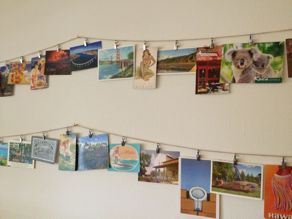
Hands down The Little Mermaid was my favorite Disney movie as a child. Ariel had the collection. All her thing-ama-bobs and Dinglehoppers. I cant say that I have a collection like she did but I do have a few things that I collect to remind me of events, trips, and just the fun things in life.
I’m really not much of a collector of expensive things or big things. I like to keep it simple. So for me I collect post cards of the places I have been and I display them on a clothes line in my office. Not only does it remind me where I have gone but it inspires me to continue to dream and go places. This isn’t my wall but it does look something like this.
I also collect shot glasses. Small and easy to store if you get a trinket cabinet. I have glasses from 21st birthday, college graduation, friend’s weddings, career changes. I will be going out to buy one here soon now that I have passed the exams required for my Real Estate License. So excited to move forward. I will by another one when I sell my first house and when I buy my first investment property.
When I do have time I have a collection of scrapbooks. I love piecing together the people in my life I make memories with. Maybe its a theme but I just want to look back at the moments, a good concert, a family Christmas, a cruise to Hawaii. We are so quick to move on to the next that we forget to be thankful for the past experiences. I want to combine them, so I collect the images as I go. Maybe after I get my license and a few houses I will have sometime to create another.
That’s all I’ve got. Nothing crazy. Oh yeah and a stack of books that one day I might be able to read thru but does that really count??