Posted in Uncategorized

Is Lime Wash Coming Back?

What Is Limewash? A Modern, Warm Take on a Timeless Technique

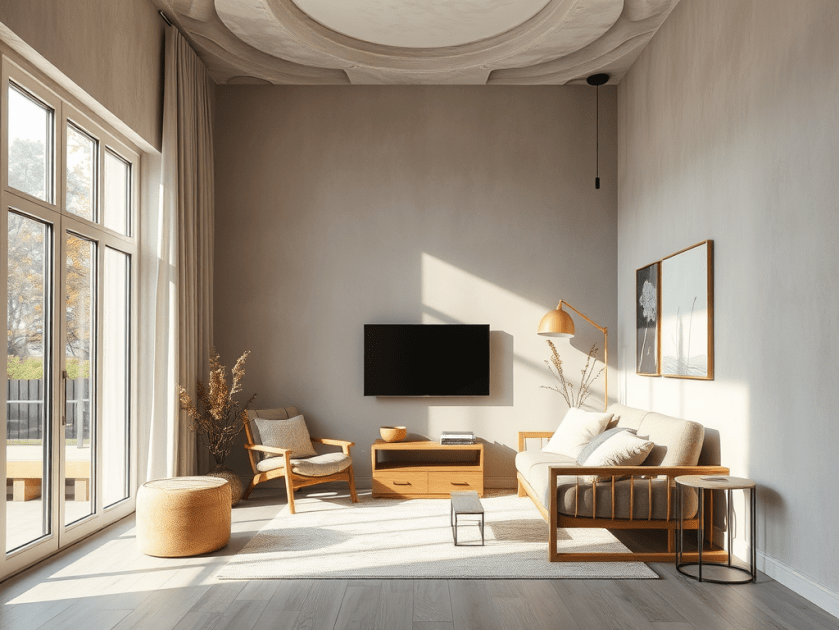
Limewash is one of the oldest paint finishes in the world, used for thousands of years by cultures like the Greeks and Romans. It’s made from natural materials—slaked lime, water, and mineral pigments—so it creates a soft, matte finish that feels warm, calming, and breathable. Unlike regular paint, limewash actually sinks into the surface, giving it that cloudy, layered look everyone loves right now.

How Limewash Works

Here’s the modern homeowner version:

  • Prep matters. The walls need to be clean and smooth so the limewash can absorb properly.
  • It’s mixed by hand. Lime powder and water are blended with natural pigments to create your custom color.
  • It’s applied in thin layers. Each coat dries with soft movement and texture, giving the space a cozy, lived-in feel.
  • It ages beautifully. Limewash isn’t supposed to look perfect — that’s the charm.

Why Homeowners Are Loving It Right Now

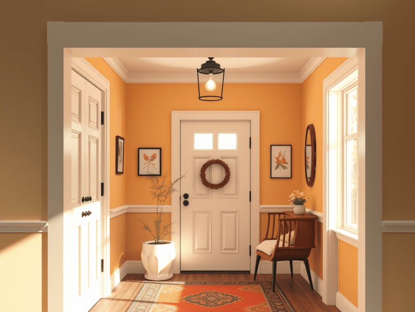
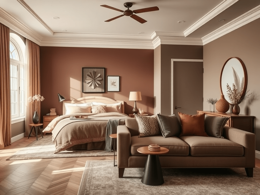
Limewash fits perfectly with today’s warm, modern aesthetic. It adds depth and softness without feeling heavy or overly textured. It also pairs beautifully with:

  • Warm greys — cozy, elegant, and calm
  • Soft lavenders — subtle, modern, and surprisingly neutral
  • Natural woods + warm metals — gold, champagne bronze, walnut

If you want walls that feel warm, relaxed, and effortlessly elevated, limewash is an incredible option.

Trending Colors for a Warm Modern Home

For clients searching for a modern-but-soft vibe, I often recommend:

  • Warm greys with gentle movement
  • Lavender-gray washes for a serene, elevated feel
  • Soft clay and mushroom tones for a more organic look

These tones glow beautifully in natural light and instantly make a room feel more intentional.

The Bottom Line

Limewash gives you a finish that looks high-end without feeling fussy — perfect for homeowners who want something modern, warm, and full of character. It’s a timeless technique that works beautifully in today’s design styles.

Posted in Uncategorized

Got to go for a High Rise job this week.

I got called for a client that just purchased a high rise condo on the north west side of the strip. It is always fun for me to get to go into these higher cleintele locations and see just what is out there waiting for me. This couple just wanted to keep things simple, two maybe three colors. And that is what we did. But it gave me some other thoughts for those that might have their own project like this.

So below are the five tips I came up with if you or someone you know has the opportunity to enjoy the view from above. Hope you will pass them on 🙂

5 Tips for Redecorating a High-Rise Condo

This week’s inspiration came from helping a power couple redesign their new high-rise overlooking the Las Vegas Strip. They wanted to capture the energy of the city without overwhelming the space — elegant by day, electric by night. Here’s how we did it (and how you can, too!):

Tip #1 Neutral walls let the view shine.
For their living area, we kept the walls by the windows a warm, soft neutral so the Strip lights became the main feature.
👉 Try this: If you have a stunning city view, go subtle on color near the windows — it naturally frames the skyline like a piece of art.

Tip #2 Lighting is your secret weapon.
Their condo had great windows but limited overhead light, so we layered floor lamps, sconces, and pendants to keep things bright and moody when needed.
👉 Try this: Mix lighting sources — ambient, accent, and task — to create dimension and highlight your favorite areas.

Tip #3 Pops of color bring personality.
We used deep navy and gold accents to reflect the nighttime city vibe, adding a playful balance to the neutral backdrop.
👉 Try this: Add bold color through art, pillows, or one statement wall — it keeps things lively without feeling cluttered.

Tip #4 Scale matters — less is luxe.
Instead of oversized sectionals, we chose sleek seating for four and a compact dining table for two that still feels open and inviting.
👉 Try this: Choose pieces that fit your space comfortably — airy silhouettes and smaller groupings keep the room feeling spacious.

Tip #5 Mirror the magic of your view.
We tied in the skyline with metallic artwork that shimmered like the Strip lights at night.
👉 Try this: Select artwork or décor that echoes your surroundings — whether that’s city lights, desert tones, or sky-inspired abstracts.

Let your space tell your story — balance sophistication with the sparkle of the city you love.

Posted in Design Elements, Lifestyle, Tips & Tricks

One Project at a Time..

The Power of Breaking It Down

Let’s be honest—transforming a home can feel a lot. Between Pinterest boards, paint swatches, and all the “what ifs,” it’s easy to end up overwhelmed before you even begin.

But here’s the truth: you don’t have to do it all at once.

In fact, taking it one step at a time is not only okay—it’s smart. Whether you’re working with a full-house refresh or just trying to make a few rooms feel more “you,” breaking things down into manageable steps can save your sanity (and your budget).


Start with What Matters Most

Instead of tackling the entire house in one go, focus on the areas that will make the biggest difference right away—think the entryway, living room, or kitchen. These are the spaces guests see first, but more importantly, they’re the ones you walk through every single day.

A fresh coat of paint in the entry or some updated lighting in the kitchen can make your whole home feel different—without touching every single room.


Room by Room, Floor by Floor

There’s no rule that says everything has to be done at once or even all in the same week (or month, or year!).

You might choose to move floor by floor—starting downstairs where the most traffic happens and working your way up when the time, budget, or energy allows. Even if you’re planning to use the same paint color throughout the house, it’s okay to spread it out.

Or maybe it makes more sense to go room by room. Especially if you’re still figuring out how each space will be used. Is that spare room going to be a guest room? A home office? A playroom? Taking your time gives you room to decide.


Make It Personal (and Functional)

The best transformations aren’t just pretty—they work for the people who live there. Before you commit to any big changes, think about the purpose of each room.

Who uses the space? What do you need it to do? What vibe are you going for?

Taking a beat to figure those things out will help you make choices you won’t regret later. Rushing into a design without a clear vision is often what leads to “I wish I had done it differently.”


Progress Is Still Progress

Remember: Rome wasn’t built in a day.

There’s absolutely no shame in doing things slowly. In fact, it often leads to better, more thoughtful results. Taking your time means you can make decisions with confidence, spread out expenses, and enjoy each win as it comes.

So if your home doesn’t feel “done” yet, that’s okay. It’s a work in progress—just like all the best things are.


Want help figuring out where to start? Let’s break it down together.
Sometimes all you need is a plan—and a little color guidance. 🎨

Posted in Uncategorized

How to Incorporate Mocha 2025’s Color of the Year Into Your Home

2025 is all about warmth and comfort, and the Color of the Year perfectly captures that inviting energy. Whether it’s a soft, earthy tone or a bold, grounding shade, this year’s pick is all about creating a home that feels both stylish and soothing. Not sure how to weave this trend into your space? We’ve got you covered with easy, stylish ways to make 2025’s Color of the Year a seamless part of your home.

Refresh Your Bedroom with the Color of the Year

Your bedroom should be a sanctuary, and 2025’s Color of the Year can help set the perfect mood. A soft, warm shade can make your space feel cozy and cocooning, while a deeper, richer hue can add a touch of sophistication.

  • Walls & Accent Walls: Go all-in with a full-room color drench, or create a striking accent wall behind your bed. If painting the entire room feels like too much, consider a color-blocking technique with a complementary neutral.
  • Textiles & Decor: Swap out bedding, pillows, and throws for versions in the Color of the Year. A subtle patterned duvet or curtains in this shade can refresh the room without overwhelming it.
  • Furniture & Accessories: A bedside table or upholstered headboard in the year’s signature hue adds a stylish focal point without the commitment of painting.

Elevate Your Living Room with Accents and Layers

The living room is the heart of the home, making it the perfect place to experiment with the Color of the Year. Whether you love a minimalist look or a bold, layered aesthetic, this shade can work beautifully in different ways.

  • Statement Furniture: A sofa or armchair in the Color of the Year can instantly refresh your space. If a new piece isn’t in the budget, consider slipcovers or reupholstering an existing piece.
  • Wall Treatments: Paint an accent wall, add color through framed artwork, or even opt for wallpaper in a subtle version of the hue. Textured finishes like grasscloth or linen wallpapers can add even more dimension.
  • Decor & Accessories: Think vases, rugs, and coffee table books in this shade. Layering in small doses keeps the look cohesive without feeling overdone.

Incorporate the Color of the Year in Your Kitchen & Dining Area

Even the kitchen can benefit from a dose of the Color of the Year, especially in ways that feel fresh and inviting.

  • Cabinetry & Backsplashes: For those ready to take the plunge, painting lower cabinets or a kitchen island in the Color of the Year adds instant charm. If you prefer a low-commitment approach, a tile backsplash or open shelving with colorful dishware works just as well.
  • Dining Chairs & Table Decor: Bring in the shade through upholstered chairs, table runners, or even placemats and dishware. These small changes make a big impact without requiring a full remodel.
  • Lighting & Fixtures: Pendant lights or small appliances in the Color of the Year can add just the right pop of color while keeping things functional.

Make a Statement with a Bold Front Door or Entryway

First impressions matter, and using the Color of the Year at your entryway sets the tone for the rest of your home.

  • Front Door Refresh: A fresh coat of paint on your front door in this trendy hue adds instant curb appeal and warmth.
  • Entryway Walls & Decor: A console table, mirror frame, or even a bold patterned wallpaper in the Color of the Year can create a welcoming focal point.
  • Plants & Accessories: Complement the shade with natural elements like wooden benches, woven baskets, and greenery to balance out the look.

Whole-Home Harmony: Pairing the Color of the Year with Other Tones

To create a cohesive look, mix 2025’s Color of the Year with other trending shades. Warm neutrals like taupe and soft terracotta create a cozy and seamless flow, while cool blues and greens add a refreshing contrast.

  • Layering Warm & Cool Tones: Pairing the Color of the Year with soft blues or greens keeps your home feeling dynamic yet harmonious.
  • Metallic & Natural Accents: Brass, copper, and natural wood tones enhance the warmth of the hue, making it feel rich and inviting.
  • Textures & Patterns: Play with different textures—woven fabrics, textured wallpapers, and natural materials like stone and clay can elevate the space while keeping it grounded.

Final Thoughts: Making 2025’s Color of the Year Work for You

Whether you go all in with color-drenched walls or opt for subtle accents, 2025’s Color of the Year offers endless possibilities to refresh your space. The key is to integrate it in ways that reflect your personal style, creating a home that feels both stylish and uniquely yours. So grab a paintbrush, swap out some decor, and let this year’s must-have hue bring new life to your home!

Posted in Uncategorized

Reviving the Retro: A Mid-Century Modern Makeover

Today’s journey took us on a groovy trip back to the swinging ’60s! My client had a sleek, modern home but wanted to infuse it with the timeless charm of mid-century modern style. Armed with a collection of vintage furniture and a passion for retro vibes, we set out to transform her space into a mid-century masterpiece.

First stop: the color palette. We wanted hues that screamed “retro chic,” so we opted for rich umber and orange wood finishes to add warmth and depth to the interiors. These colors weren’t just about looks – they were about capturing the essence of an era marked by optimism and innovation.

Next up: the furniture. Mid-century modern design is all about clean lines and geometric shapes, so we brought in iconic pieces like the Eames Lounge Chair and the Noguchi Coffee Table to anchor the space. These pieces weren’t just stylish – they were functional works of art that added a touch of sophistication to every room.

But it wasn’t just about the furniture; it was about the details, too. We incorporated bold, repetitive patterns in rugs and cushions to add visual interest without overwhelming the space. And let’s not forget about the lighting fixtures – clean, angular designs that created striking visual contrasts and emphasized the room’s clean lines.

Of course, no mid-century modern makeover would be complete without the perfect color scheme. We opted for warmer tones like mustard yellows, burnt oranges, and deep reds to highlight the unique shapes and textures of our vintage pieces. Complementary colors like rich browns and greens helped maintain a cohesive look while adding pops of vibrancy throughout the space.

And the finishing touches? Geometric artwork and accents that added a touch of sophistication and visual interest to every room. Whether it was a funky wall hanging or a sleek light fixture, these little touches were what tied the whole look together and brought our mid-century vision to life.

So there you have it – a crash course in reviving the retro with mid-century modern style. By understanding the elements that define this timeless design era – from clean lines to warm tones – we were able to create a space that was both fun and functional, colorful and educational. And the best part? It’s a style that’s as relevant today as it was back in the swinging ’60s. So go ahead, dust off those vintage finds and let your inner mod shine!

Posted in Design Elements

Healing the waiting room with color

Creating a Welcoming Atmosphere in Doctor’s Offices

Visiting a doctor’s office can often be a daunting experience for many. The sterile and cold environment of these spaces can contribute to feelings of anxiety and discomfort. However, it doesn’t have to be this way. By incorporating thoughtful design elements, such as color, artwork, and comfortable seating, it’s possible to transform these spaces into warm and inviting environments that promote a sense of calm and well-being.

The Impact of Color

Color has a profound effect on our emotions and can significantly influence our mood. In the context of a doctor’s office, opting for calming and soft cheerful colors can help alleviate feelings of stress and apprehension in patients. Studies have shown that the use of soothing colors in healthcare environments can contribute to improved patient outcomes and overall well-being. Soft tones such as pale blues, gentle greens, and warm neutrals can create a sense of tranquility and comfort, making the space more welcoming for patients.

Artwork and Decor

Introducing artwork with a hopeful and uplifting theme can have a positive impact on the atmosphere of a doctor’s office. Inspirational pieces that convey messages of healing, resilience, and positivity can serve as a source of comfort and encouragement for patients during their time in the waiting room. Additionally, the inclusion of artificial plants can bring a touch of nature indoors, adding a refreshing and calming element to the space.

Furthermore, incorporating a statement color, such as a feature wall in a warm and inviting hue, can instantly transform the ambiance of the waiting room. This bold choice can inject personality and vibrancy into the space, setting a welcoming tone for patients as soon as they enter.

Finally, the seating in the waiting room plays a crucial role in ensuring the comfort of patients. Opting for chairs and sofas that are not only aesthetically pleasing but also ergonomically designed can make a significant difference in the overall experience of individuals waiting to see the doctor. Comfortable seating arrangements can help reduce feelings of unease and create a more relaxed environment.

In conclusion, the design of a doctor’s office plays a pivotal role in shaping the experiences of patients. By incorporating elements such as calming colors, uplifting artwork, a statement color, artificial plants, and comfortable seating, it’s possible to create a warm and inviting atmosphere that promotes a sense of ease and well-being for all those who walk through the doors.

Posted in Uncategorized

Bringing the Outside In: Adding Texture to Your Home

Many modern homes today feature smooth walls and polished granite surfaces, creating a sleek and polished look. While this aesthetic can be visually appealing, it can also feel a bit one-dimensional and lacking in character. If you’re looking to add some depth and visual interest to your living space, consider incorporating different textures into your home decor.

1. Incorporating Slate and Rock

One way to introduce texture into your home is by using slate or rock accents. For example, you can add a slate or rock facade around your indoor fireplace to create a focal point in your living room. The natural variations in color and texture will instantly add visual interest and make your fireplace stand out. In the bathroom, consider using river rock tiles for your shower floor or as a border to add a touch of nature and create a spa-like atmosphere. In the kitchen, slate countertops can provide a pop of color and an edgy, contemporary look. Opt for honed finished granite with a weathered edge to add a touch of rustic charm to your kitchen island or bar area.

2. Adding Texture to Floors

If you’re tired of the smooth and uniform look of traditional flooring materials, consider opting for rustic or weathered wood or tile. These materials add warmth, character, and texture to your floors. Weathered wood flooring, for example, features a distressed look that adds a sense of history and charm to any room. Rustic tile with a textured finish can create a visually interesting pattern and add depth to your floors. Whether you choose wood or tile, textured flooring can make a significant impact on the overall look and feel of your home.

3. Embracing Natural Elements

Another way to bring texture into your home is by incorporating natural elements. Consider using woven or textured fabrics for your curtains, throw pillows, and upholstery to add depth and visual interest to your living room or bedroom. You can also bring in natural materials such as jute or sisal rugs to add texture to your floors. Additionally, consider incorporating plants and greenery into your home decor. Not only do plants add a touch of nature, but their varied shapes and textures can also bring a refreshing and organic feel to any space.

In conclusion, adding texture to your home is a great way to bring the outdoors in and create a more visually interesting and dynamic living space. Whether you choose to incorporate slate and rock accents, textured flooring, or natural elements, these design choices will add depth and character to your home decor. So, don’t be afraid to experiment and have fun with different textures to create a unique and inviting atmosphere in your home.