Posted in Design Elements

Transforming Your Home: From Beige to White Elegance

From Beige to White: Adding Warmth and Style to Your Home

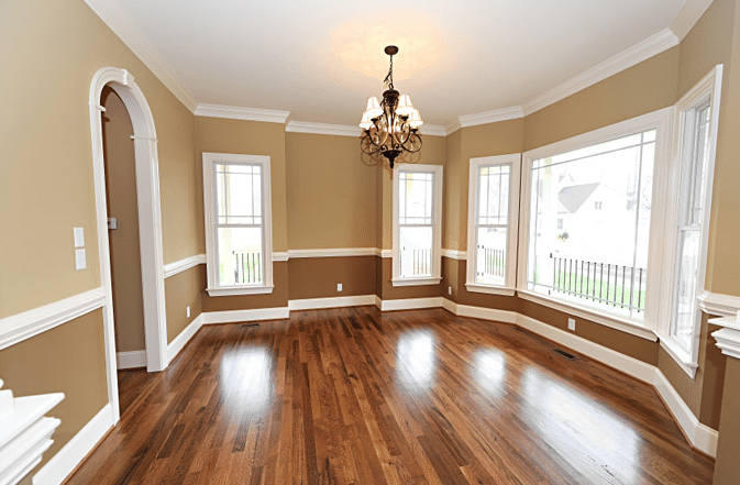
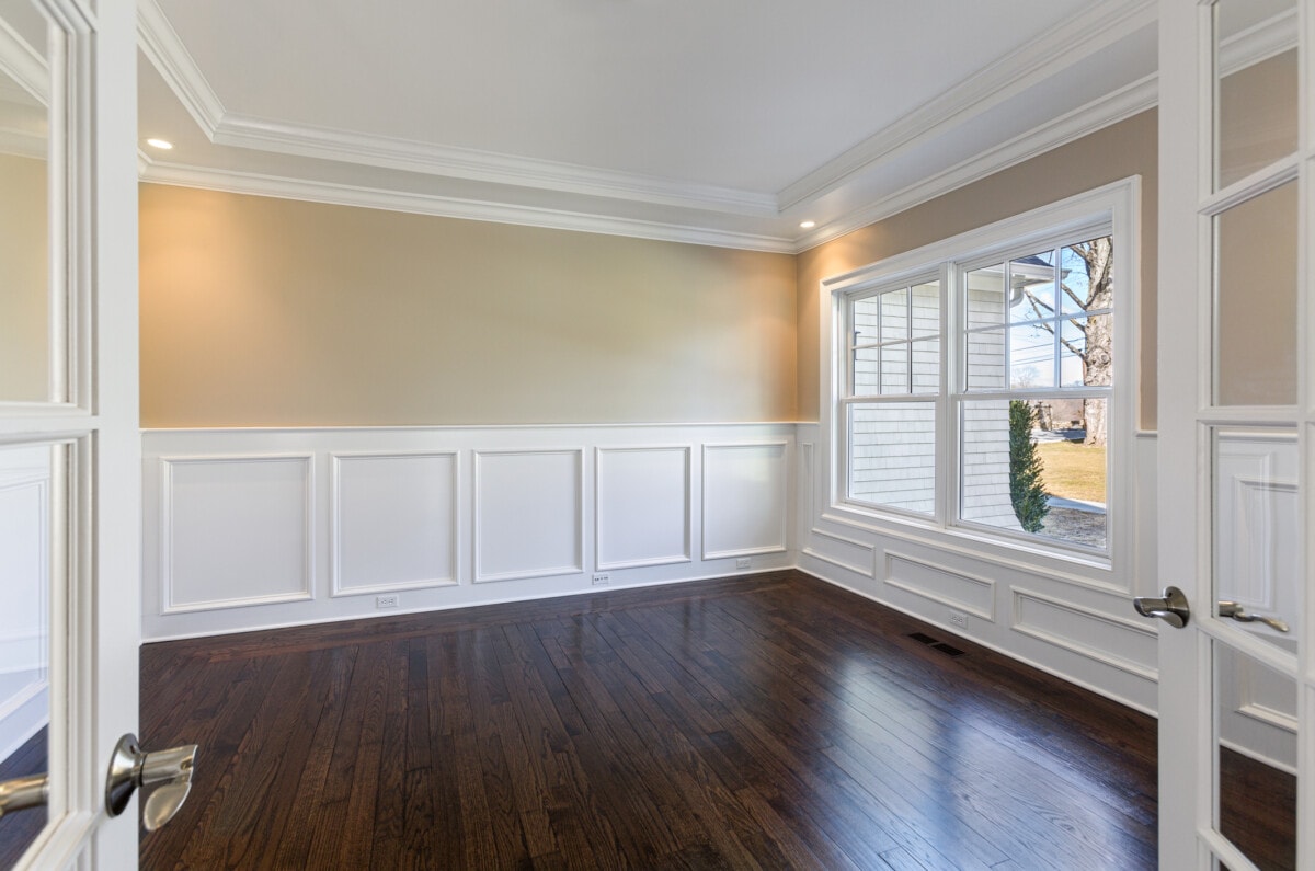
Are you tired of the dull and lifeless beige walls in your home? Do you want to create a fresh and inviting space without making it feel sterile? Look no further than the timeless elegance of white walls. Whether you prefer warm whites or cool whites, this versatile color can transform your home into a modern and refreshing sanctuary.

Choosing the Right Shade of White

When it comes to white walls, there are countless shades to choose from. Warm whites, with their undertones of cream or beige, can add a cozy and inviting atmosphere to any room. On the other hand, cool whites, with hints of blue or gray, can create a modern and clean aesthetic. The key is to find the perfect balance that suits your personal style and complements your existing decor.

Using White as a Canvas

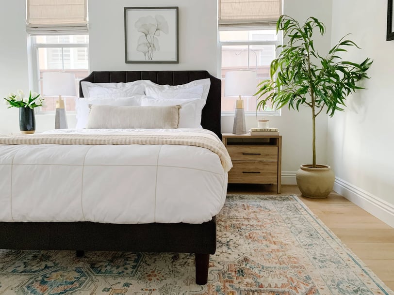
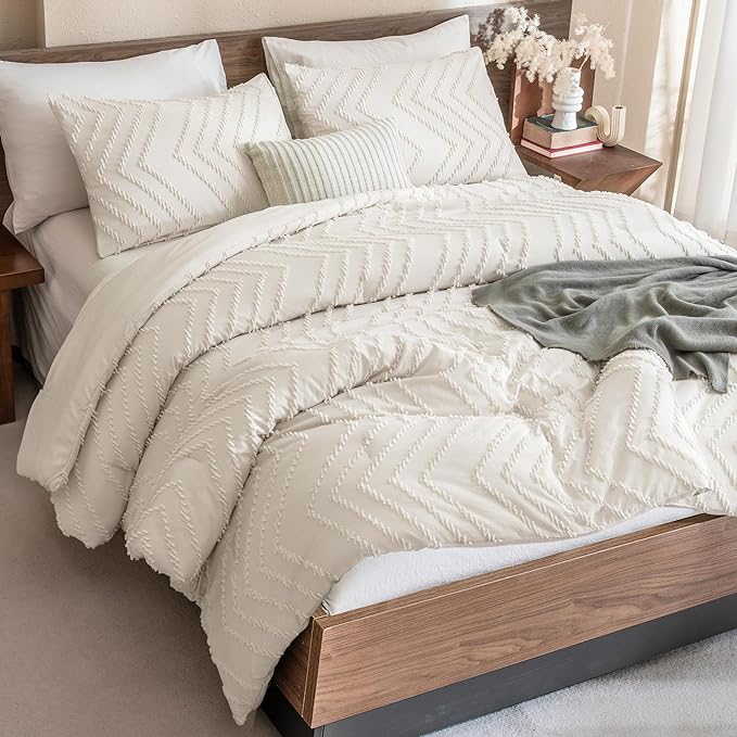
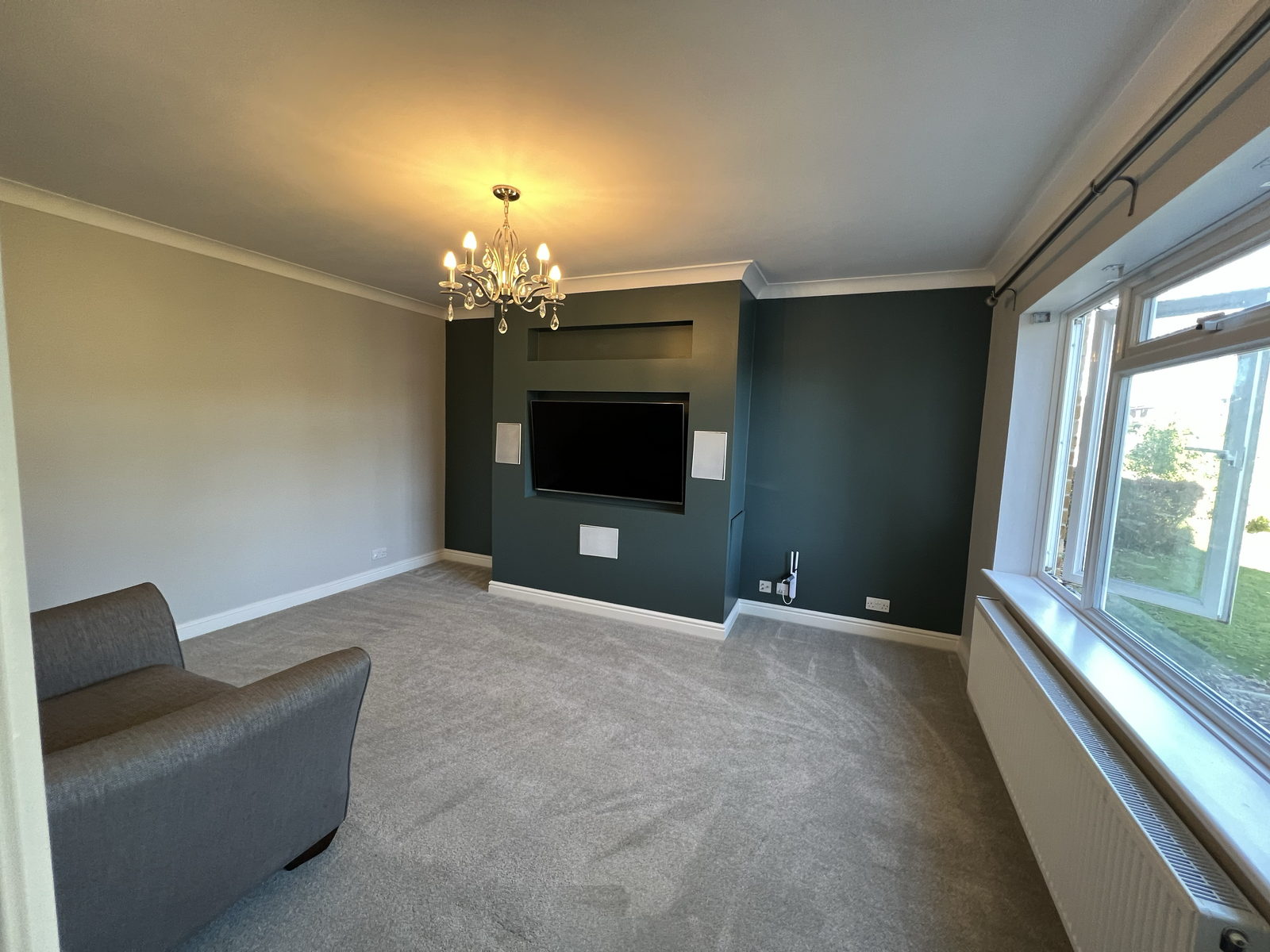
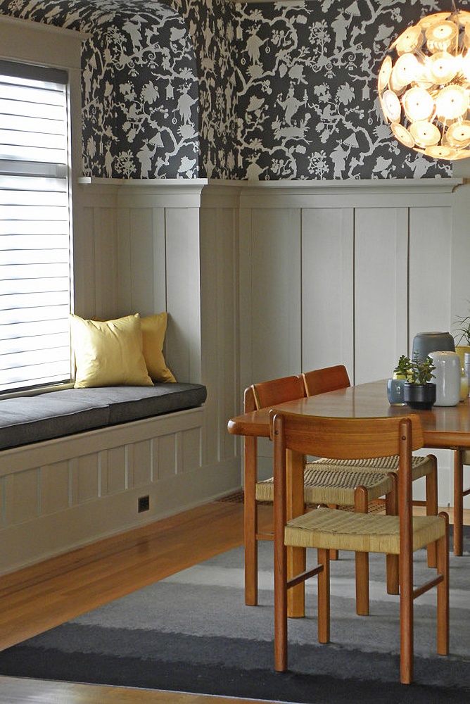
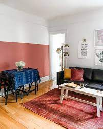
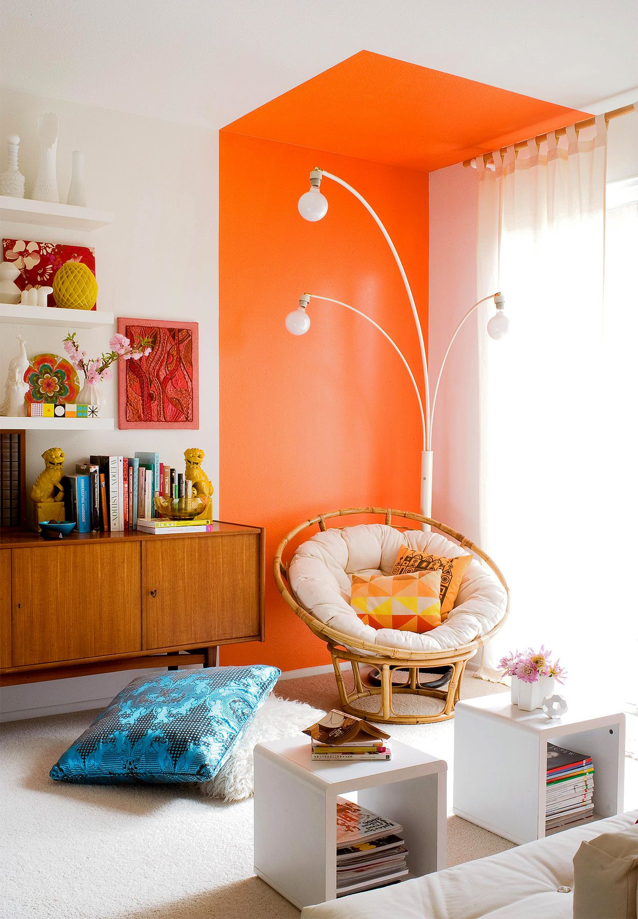
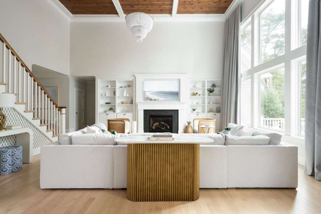
One of the greatest advantages of white walls is the endless possibilities they offer for adding accents and personal touches. By using white as a base, you can easily incorporate pops of color, patterns, and textures to create a unique and personalized space. Whether you prefer a modern farmhouse look or an airy boho style, white walls provide the perfect backdrop for your creativity to shine.

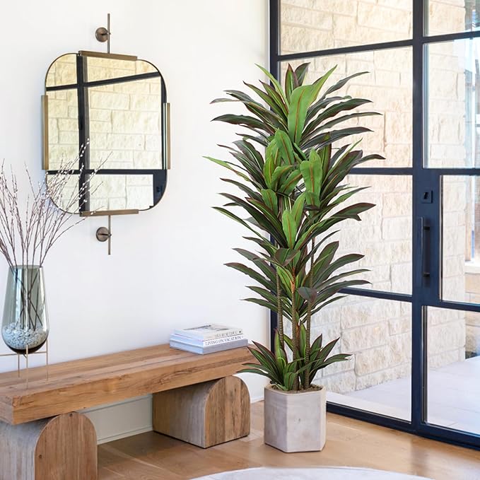
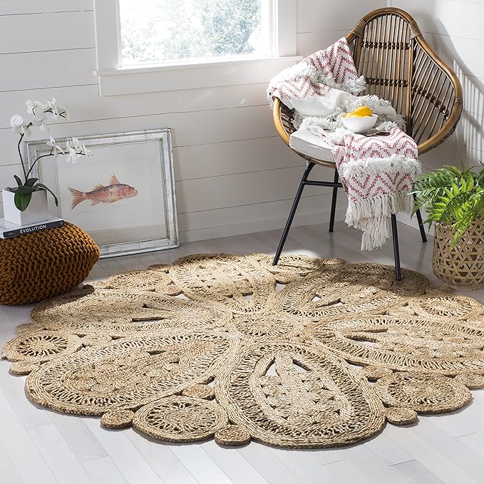
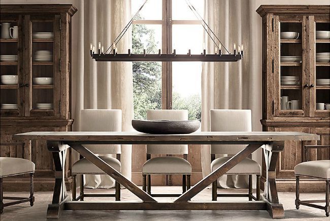
For a modern farmhouse vibe, consider pairing your white walls with rustic wooden furniture, vintage accessories, and cozy textiles. This combination creates a warm and inviting atmosphere that is both timeless and on-trend. On the other hand, if you’re drawn to the airy boho style, combine your white walls with natural materials, such as rattan or jute, and add pops of greenery for a fresh and organic feel.

Popular White Paint Brands

When it comes to choosing the perfect shade of white, there are a few popular paint brands that are known for their quality and extensive range of white hues. Dunn Edwards and Sherwin Williams are two such brands that offer a wide selection of whites to suit every taste and style. From warm off-whites to cool crisp whites, these brands have you covered.

Remember, when selecting a white paint, it’s essential to test it in different lighting conditions and against your existing decor. The right shade of white can make all the difference in creating the desired atmosphere and ambiance in your home.

In conclusion, transitioning from beige to white walls can breathe new life into your home. Whether you opt for warm or cool whites, white walls provide a blank canvas for your creativity to flourish. With the right accents and personal touches, you can transform your space into a modern and inviting sanctuary. So, why wait? Embrace the beauty of white and embark on a journey of style and warmth.

Posted in Tips & Tricks

Transform Your Bedroom with Simple Changes

Refresh Your Bedroom with Simple Changes

Is your bedroom feeling a bit dull and uninspiring? It’s time for a refresh! You don’t need to spend a fortune or completely overhaul the space to breathe new life into your bedroom. With a few simple changes, you can create a cozy and inviting atmosphere that you’ll love spending time in. Here are some easy ideas to get you started:

Change Up Your Bed

Your bed is the focal point of your bedroom, so why not give it a fresh look? Consider swapping out your bedspread for one in a different color or texture. A new spread can instantly transform the vibe of your room. Opt for a vibrant color to add a pop of excitement or choose a soft, textured fabric for a touch of luxury. You’ll be amazed at how this simple change can make your bed feel brand new.

Let the Light In

Don’t underestimate the power of natural light in creating a bright and airy space. Open up those windows and let the sunshine in. If you currently have heavy blackout drapes, consider switching to sheer curtains or lighter-colored window treatments. These will allow more light to filter through and create a more cheerful and inviting atmosphere in your bedroom.

Add Some Flair with Pillows and Blankets

When it comes to pillows and blankets, more is more! You can never have enough options for layering and styling your bed. Experiment with different colors, patterns, and textures to create a cozy and inviting look. Mix and match pillows of different sizes and shapes, and don’t forget to add a few throw blankets for extra warmth and style. These small additions can make a big impact on the overall aesthetic of your bedroom.

Bring in New Decor

To truly refresh your bedroom, consider adding some new decor pieces. This could be anything from vases and books to wall art or even a new plant. These little touches can add personality and style to your space. Choose items that reflect your taste and make you feel happy and inspired. Whether it’s a unique piece of artwork or a trendy plant, these additions will breathe new life into your bedroom.

Switch Up Your Flooring

If you have wood or tiled floors in your bedroom, consider switching out that heavy wool rug for a jute or woven rug. These natural fiber rugs add warmth and texture to your space, making it feel cozy and inviting. Plus, they are perfect for creating a bohemian or coastal vibe in your bedroom. With a new rug underfoot, you’ll feel like you’re stepping into a whole new room.

Refreshing your bedroom doesn’t have to be a daunting task. By making these simple changes, you can transform your space into a cozy and inviting sanctuary. So go ahead, give your bedroom the refresh it deserves!

Posted in Uncategorized

Creating a Restoration Hardware-Inspired Color Palette

Creating a Restoration Hardware-Inspired Color Palette

When it comes to interior design, Restoration Hardware is known for its elegant and timeless aesthetic. The brand’s color palettes and design choices have become a popular source of inspiration for many homeowners and designers alike. If you’re looking to achieve a similar look for your space, here are some tips on creating a Restoration Hardware-inspired color palette.

1. Warm Neutrals

Restoration Hardware is known for its use of warm neutrals, such as beige, cream, and taupe. These colors create a sense of warmth and coziness in a space, making it inviting and comfortable. Consider using these warm neutrals as the base colors for your color palette.

2. Bronzed Metallics

To add a touch of luxury and sophistication to your space, incorporate bronzed metallics into your color palette. Brass, copper, and bronze accents can be used in lighting fixtures, hardware, and decorative accessories. These metallics add a subtle sheen and richness to the overall design.

3. Simple Lines and Materials

When it comes to furniture and decor, Restoration Hardware favors simple lines and materials. Look for pieces that have clean and minimalistic designs, such as streamlined sofas, sleek dining tables, and understated accessories. Materials like wood, linen, and leather are commonly used by the brand and can help you achieve that timeless and classic look.

Affordable Textures

While Restoration Hardware is known for its high-end products, you don’t have to break the bank to achieve a similar look. Look for affordable alternatives that mimic the textures used by the brand. For example, instead of investing in a genuine leather sofa, consider a high-quality faux leather option. Look for affordable linen curtains or textured wallpaper to add depth and interest to your space.

Remember, creating a Restoration Hardware-inspired color palette is all about capturing the essence of the brand’s design aesthetic. By using warm neutrals, incorporating bronzed metallics, opting for simple lines and materials, and finding affordable textures, you can achieve a similar look and feel in your own home. So go ahead and get inspired by Restoration Hardware’s timeless and elegant design!

Posted in Uncategorized

Colors of Spring: Purples

The Meaning of Purple

Purple is a captivating color that holds a unique place in the spectrum. It is often associated with royalty, luxury, and power. At the same time, it also evokes a sense of calmness, light-heartedness, and even romance. The varying shades of purple offer different emotions and moods.

The Tranquil and Relaxing Light Purples

Light purples, such as lavender and lilac, have a gentle and soothing effect on our senses. These shades are often associated with tranquility, relaxation, and a peaceful state of mind. They can create a serene atmosphere, making them perfect for bedrooms, meditation spaces, or any area where you want to unwind and de-stress.

When using light purples in your home decor, you can create a sense of calmness and tranquility. Soft purple accents in pillows, curtains, or wall art can add a touch of elegance and serenity to any room. Pairing light purples with neutrals, such as whites or grays, can enhance their relaxing effect.

The Luxury of Dark or Intense Purples

On the other end of the spectrum, dark or intense purples, such as plum or eggplant, exude a sense of luxury and opulence. These deep shades are often associated with power, wealth, and extravagance. They can add a touch of sophistication and drama to any space.

Dark purples can be used as accent colors to create a bold and luxurious statement. A deep purple accent wall or a plush velvet purple sofa can instantly elevate the ambiance of a room. Pairing dark purples with metallic accents, such as gold or silver, can enhance their regal and luxurious feel.

Combining the Two Sides of Purple

When it comes to incorporating purple into your decor, you can choose to embrace either the tranquil light purples or the luxurious dark purples. However, you can also create a harmonious balance by combining both sides of purple.

For example, you can use light purples as the base color and add pops of dark purple accents to create a striking contrast. This combination can create a sense of depth and richness in your space. Alternatively, you can use dark purples as the dominant color and incorporate light purple elements to soften the overall look.

Remember, the key is to find the right balance that suits your personal style and the atmosphere you want to create. Whether you choose to embrace the royalty and luxury of dark purples or the calmness and light-heartedness of light purples, purple is a versatile color that can transform any space into a captivating and enchanting haven.

Purples are our last in the Spring Color Series. As with my other pallets these inspiration items can be found on my Amazon Shop page. Up next we we will be diving into new trends for home and garden or I might change it up with tricks to spice up your kitchen. Pun intended 🙂

Posted in Uncategorized

Spring Oranges

Orange Symbolizes Joy, Happiness, Energy, and Creativity

Orange is a vibrant and energetic color that is often associated with feelings of joy, happiness, and creativity. It is a color that can evoke a sense of warmth and excitement, making it a popular choice in various settings, including the outdoors, gym, and office/living spaces.

Orange for Outdoors

When we think of the color orange in outdoor settings, we often associate it with the beauty of nature. The warm and inviting hues of orange can be found in stunning sunsets, autumn leaves, and blooming flowers. These natural occurrences of orange can bring a sense of joy and happiness to anyone who appreciates their beauty.

Additionally, the color orange is often used in outdoor recreational spaces, such as patios and pools. This is because orange is known to be an attention-grabbing color that can stimulate energy and excitement. The presence of orange in these areas can enhance the overall experience and create a positive and lively atmosphere.

Need some Motivation?

Orange is a popular color in gym settings due to its association with energy and motivation. Many fitness centers incorporate orange into their branding, equipment, and decor to create an environment that inspires and energizes their clients.

Studies have shown that the color orange can increase determination, making it an ideal choice for gym spaces. The presence of orange can help individuals push through their workouts and achieve their fitness goals. Whether it’s the vibrant orange walls, equipment, or motivational quotes displayed in orange, this color can have a positive impact on one’s workout experience.

Orange life in the Office

In office and living spaces, the color orange can promote creativity and productivity. It is believed to stimulate the mind and encourage innovative thinking. Incorporating orange accents, such as furniture, artwork, or accessories, can create a vibrant and stimulating environment.

Furthermore, the color orange is known to enhance social interaction and communication. It can create a warm and inviting atmosphere that encourages collaboration and teamwork. Whether it’s an orange accent wall, decorative elements, or even fresh orange fruit displayed, this color can contribute to a positive and productive work or living environment.

Conclusion

The symbolism of orange as a color of joy, happiness, energy, and creativity is evident in various settings. Whether it’s the natural beauty of orange in outdoor spaces, the motivational impact of orange in the gym, or the stimulating effect of orange in office and living spaces, this color has the power to enhance our experiences and evoke positive emotions. Consider incorporating orange into your surroundings to bring a sense of vibrancy, enthusiasm, and inspiration into your life.

Most of the inspiration items in the above boards can be found in my amazon shop link. They will be available tomorrow 3/29. Hope you will add some energy into your living spaces!!

Posted in Uncategorized

Reds and Pinks of Spring

Spring is a season of renewal and rejuvenation, and what better way to embrace this spirit than by incorporating the vibrant colors of red and pink into your home decor? Whether you prefer bold and bright hues or soft and feminine tones, the reds and pinks of spring can add just the right touch to any space.

Bright and Vibrant

If you’re looking to make a statement, opt for bright and vibrant shades of red and pink. These colors can instantly energize a room and create a sense of excitement. Consider using red and pink accents in your floral arrangements to bring a pop of color to your living room or dining area. A bouquet of red roses or a vase of pink tulips can instantly brighten up any space and add a touch of romance. You can add the pop of color into your personal look as well by bringing in bright hats, belts, shoes and even makeups.

Another way to incorporate bright and vibrant reds and pinks is through the use of throws. A bold red or hot pink throw blanket or pillow can add a splash of color to a neutral sofa or armchair. Not only will it provide warmth and comfort, but it will also serve as a stylish focal point in the room.

Soft and Feminine

If you prefer a more subtle approach, opt for soft and feminine shades of red and pink. These colors can create a calming and soothing atmosphere in any room. Consider using light pink curtains or blush-colored pillows to add a touch of elegance to your bedroom or nursery. These soft hues can create a sense of serenity and relaxation, perfect for unwinding after a long day. You can also bring in pieces for your coffee table or shelves, glass vases or book stacks in similar colors.

Lighting is another way to incorporate soft and feminine reds and pinks into your home decor. Consider using a pink lampshade or a red pendant light to create a warm and inviting ambiance in your living room or dining area. The soft glow of these lights can create a cozy and intimate atmosphere, perfect for entertaining guests or enjoying a quiet evening at home.

xr:d:DAGAixQ3BEs:12,j:1172484620338194639,t:24032520

Elegant and Informal

One of the great things about the reds and pinks of spring is their versatility. These colors can be both elegant and informal, depending on how you use them. For a more formal look, consider incorporating red and pink accents into your table settings. A set of red wine glasses or pink dinnerware can add a touch of sophistication to your dining table.

On the other hand, if you prefer a more informal look, consider using red and pink accents in your outdoor space. A set of red or pink patio cushions or a floral-printed outdoor rug can create a casual and inviting atmosphere in your backyard or balcony. These colors can add a playful and whimsical touch to your outdoor decor, perfect for enjoying the sunny days of spring.

In conclusion, the reds and pinks of spring can add a vibrant and elegant touch to your home decor. Whether you prefer bright and vibrant shades or soft and feminine tones, these colors can create a sense of renewal and rejuvenation in any space. From floral arrangements to throws and lighting, there are endless possibilities for incorporating red and pink accents into your home decor this spring.

Posted in Design Elements, Uncategorized

Sound Panels

Have a group of teenagers playing rockstar in your garage? No? Im sure this is one of the things that comes to mind when you think about soundproofing. But be it a drum in the garage or an echo in a lobby, there are many different ways to use sound panels today. Today there is a wide variety of materials, style, shapes and colors available for diverse uses. Any space can be enhanced in design and in function with what is available today. I am not going to get into the technical details of each, just the design aspects. Amplitude and vibrations and thickness of material can all be researched for those truly interested.

The band in the garage is definitely something that you want to soundproof for loud obvious reasons. But what about intimate areas, or public spaces? Often times in new commercial spaces, the floor is decorative concrete and the walls are high or made of glass causing echoes. Decorative panels can blend the style and lessen the clack clack of foot traffic thru the space. Boardrooms to keep discussions private and not distracted from outside goings on. Home offices can be enhanced by putting panels on adjoining walls, this way if the kids are home and in their room, mom or dad can still quietly work. In dining areas that are open but still need to feel inviting for a nice dinner, panels can be placed behind tables or as dividers in the space. Bedrooms and spas will often use panels to help with the quiet Zen affect. There may not be music playing but that does not mean that there is no unwanted sounds.

For starters, the materials range from fabric panels to fiberglass, felt or foam panels and even woods. The material will depend on the type of sound proofing needed and the aesthetic of the space. At a basic level, wedge foam panels can be used in most spaces to dampen sound. They come in different sizes but commonly are 12×12 or 14×14 and can be egg carton , pyramid, or hexagonal. You can create patterns and some are even available in different colors.

Of course as the style or design gets more in depth or fancy, the materials and the pricing does increase. Wood panels and decorative foam tiles will cost more but they will offer you a wider variety of colors and shapes. Fabric panels are unlimited in the design aspect, you could pull any pattern or print and have custom panels made. Panels are also not limited to walls. They can be mounted on ceilings and doors depending on the sound needs of the space. In high rise business buildings this is often seen, for design and to dampen other offices above.

Wood panels can be very simple or a piece of art. Often times they are grooved or perforated. This allows the sound to enter the wood and essentially get trapped. Wood of course can also be templated or cut into embellished patterns. It can also be stained to unique colors depending on the wood species.

There are many more ways and many more designs that I could go on about. I have personally done these two. My boyfriend is a gamer and he likes a certain ambiance while he is sinking battleships in World of Warships. We kept it simple for him using black foam egg carton panels on the three walled sides of his computer. In my last office, the main wall was windows and as mentioned before the flooring was concrete. We put up 4 fabric panels on the interior wall and made it a conference room. Take into consideration the use of your space, what sound factors are in the room and the rooms or hallway adjoining. Each space will be unique. We dont think about sound until it bugs us, now maybe you have some future ideas.

Posted in Uncategorized

Two Toned Rooms

The other day, a friend asked me what my definition of a two toned room is. There are a few different versions out there. Different ways to create, using two colors, using trims or chair rails, adding cutouts etc. Unique styles range from formal and elegant such as in a dedicated dining room or office to adding a bright and fun secondary accent color.

A very simple way to create a two tone room is to divide the walls by using a decorative trim, using two materials for above and below. Usually, the trim is positioned at 1/3 or 2/3 of the room’s height and creates a border. The base can be painted, paneled, dimensioned with picture moldings or even wall papered if so desired. Often times, the trim and base is painted in a bright white, however natural and stained woods can also be used. The function and style of the room will determine the color scheme.

Many clients will choose a neutral color pallet and will pull colors in that same family, working within the different shade levels. To ground rooms while using a chair rail, a mid tone to dark rich color is chosen for the base. The upper color is one to three shades lighter than the base, essentially moving up the color card. As you can see in this room, there are two shades difference between base and upper walls.

Moldings can be added to the base in many different styles. They can be painted white, accented picture framed, paneled and even use wainscoting. Here are a few examples.

Sometimes, builders will create cutouts or recesses in the walls that can become perfect opportunities to two tone. Alcoves, tv or fireplace recess can be different color paint or can be enclosed by cabinetry giving off two tone looks.

Believ it or not, wall paper is making a comeback. There are a variety of styles from full floor to ceiling prints, half wall murals and accent images, some can even be custom printed. Advancements with wallpaper include less surface prep as adhesives are better, they are easier to work with for the everyday home owner, and some are peelable and removable if a client is in a temporary living situation such as in an apartment. Below are some examples.

Two toned in its most basic form is creating a divide with the use of color. It is not limited to dividing horizontally as you can also vertically divide a space, I personally am a fan of contrast and bright, intense colors. You can see in these images how a simple clean line of paint transforms a room.

I know that there are more ways out there to create a unique two toned design. I do hope however that this brief post will help get your ideas going. Change up the look of your room or your hallway, add in that divider or wallpaper. I hope that as I continue to help customers color their walls I will have examples of my work posted here for you to enjoy. In the mean time, don’t be afraid to experiment, Distracted Damsel signing off.