When it comes to cabinetry, wood and stained finishes are like the classic hits of interior design—always in style and forever chic. Imagine the natural beauty of wood grains and the rich, deep hues of stains transforming your kitchen or bathroom into a cozy, inviting oasis. Whether you’re vibing with the light charm of oak or the luxurious depth of mahogany, wood and stained cabinetry are design staples that’ll never go out of fashion.
Classic Whites and Creams
Whites and creams are the ultimate design superheroes—simple, elegant, and versatile. These colors offer a clean canvas, letting other elements of your room steal the spotlight. Perfect for lovers of timeless design, white and cream cabinetry can make any space feel like a breath of fresh air. They’re especially great for smaller spaces, making them look larger and more open. It’s like giving your room a chic makeover that never gets old!
Modern Dark Woods and Bold Colors
For those who crave a sleek, sophisticated vibe, dark woods and bold colors are your go-to. Think deep grays, rich browns, and inky blacks that add a touch of modern elegance to any room. Dark cabinetry makes a powerful statement and pairs beautifully with lighter countertops or backsplashes. It’s all about creating a visually striking contrast that’s both balanced and stylish.
Emerging Trends: Soft Hues
Say hello to the latest trend—soft hues! Gentle blues, serene greens, and dreamy lavenders are making waves in cabinetry design. These colors bring a fresh, calming energy to your space. Don’t shy away from these soothing shades; they can add a unique and tranquil touch to your home. Soft hues are perfect for creating a serene and welcoming atmosphere that feels like a gentle hug.
Bright and Bold: Making a Statement
Ready to make a splash? Bright colors are fantastic for adding personality and flair to playrooms, functional spaces, or bold modern designs. These vibrant hues reflect a unique taste and make a memorable statement. Just be sure to balance them with lighter elements—like glass doors or white accents—to keep the space from feeling too overwhelming. If you’ve got a favorite color, let it shine through your cabinetry design!
Endless Color Options
In the world of cabinetry, the color possibilities are as vast as your imagination. Whether you’re drawn to the timeless charm of white farmhouse styles or the eye-catching impact of a vibrant hue, there’s a perfect cabinetry color out there for everyone. The secret? Choose a color that resonates with your personality and complements your space’s overall vibe. It’s your home—make it as colorful and fabulous as you are!
Colored ceilings play a pivotal role in shaping the mood and perception of space within a room. A well-chosen ceiling color can dramatically alter the ambiance, adding a unique dimension to the overall design. Darker ceiling colors, such as deep blues or rich grays, evoke a sense of coziness and intimacy. These colors can create the illusion of a lower ceiling, making a room feel more enclosed and snug. This effect is particularly beneficial in larger living spaces or bedrooms where a more intimate setting is desired.
Conversely, lighter ceiling colors, including soft whites or pastel shades, contribute to a feeling of expansiveness and airiness. These hues can visually lift the ceiling height, opening up the space and making it appear larger and more inviting. This approach is especially effective in smaller rooms or areas that lack natural light, such as kitchens or bathrooms. By choosing light, reflective colors, the ceiling can help bounce light around the room, enhancing brightness and a sense of space.
The selection of ceiling color should be thoughtfully considered in relation to the room’s function and the desired ambiance. For instance, in a living room, a warm, inviting color on the ceiling can create a welcoming atmosphere, while a light, airy color might be more suitable for a kitchen where cleanliness and openness are paramount. Bedrooms, often a sanctuary for rest and relaxation, benefit from calming, subdued ceiling colors that promote tranquility.
Different color choices can transform the atmosphere of various types of rooms. Experimenting with ceiling colors allows homeowners and designers to craft spaces that not only meet functional needs but also enhance aesthetic appeal. Whether aiming for a cozy retreat or an open, airy environment, the ceiling’s color can be a powerful tool in achieving the desired ambiance. This nuanced approach to color application underscores the importance of viewing the ceiling as a critical element in interior design.
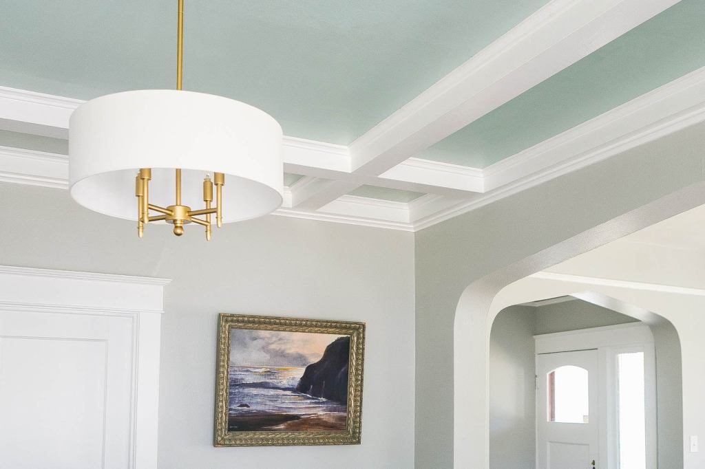
Coordinating Ceiling Colors with Furniture and Decor
Choosing the right ceiling color to complement or coordinate with your furniture and decor is essential for creating a harmonious and cohesive design. The ceiling, often referred to as the “fifth wall,” plays a pivotal role in the overall aesthetic of a room. By carefully selecting a ceiling color that either matches or accentuates the existing elements, you can significantly enhance your space.
One effective approach is to use color theory as a guide. Understanding the relationships between colors on the color wheel can help you make informed decisions. For instance, complementary colors—those directly opposite each other on the color wheel—can create a dynamic and balanced look. If your room features a lot of blue tones, a soft orange ceiling might provide a beautiful contrast while maintaining harmony. Conversely, analogous colors, which are next to each other on the color wheel, offer a more subtle and cohesive look. Pairing a green ceiling with blue and teal decor can create a serene and unified space.
Contrast is another critical factor to consider. A bold ceiling color can serve as an accent that ties together various decor items or furniture pieces. For example, a deep navy ceiling in a room with white walls and dark wood furniture can create a striking focal point, adding depth and sophistication. On the other hand, a more neutral ceiling, such as a soft gray or beige, can provide a subtle backdrop that enhances the overall aesthetic without overpowering the space. This approach works particularly well in rooms with vibrant or patterned decor, as it allows the other elements to shine.
Creating visual balance is key to a well-coordinated space. If you opt for a bold ceiling color, it is crucial to balance it with other elements in the room. This can be achieved by incorporating accessories, textiles, or artwork that echo the ceiling color. For instance, if you choose a rich green ceiling, adding green throw pillows, rugs, or wall art can help create a cohesive look. Conversely, a neutral ceiling gives you more flexibility to experiment with colorful decor items and furniture without overwhelming the room.
In summary, coordinating ceiling colors with furniture and decor involves a careful balance of color theory, contrast, and visual balance. By considering these factors, you can create a space that is both visually appealing and harmonious, transforming your room from above.
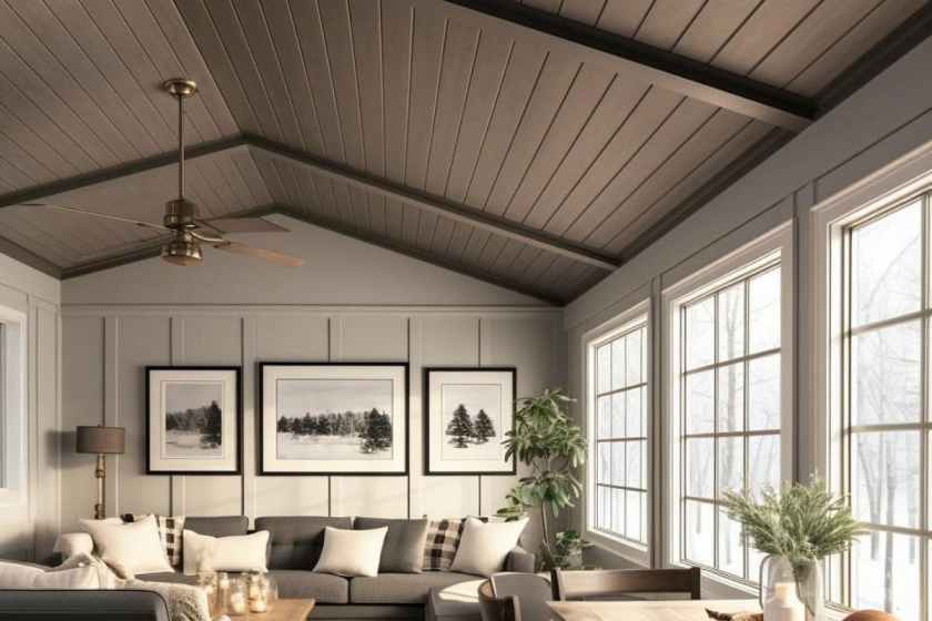
Beyond Paint: Creative Ceiling Treatments
When considering how to transform your space from above, the use of color on ceilings extends far beyond traditional paint. Creative ceiling treatments can redefine a room, adding texture, dimension, and a unique focal point. One such innovative approach is the use of patterned ceiling tiles. These tiles come in a myriad of designs, from intricate floral motifs to geometric patterns, offering a sophisticated touch that paint alone cannot achieve. Patterned ceiling tiles can introduce a sense of elegance and visual interest, making them an excellent choice for spaces that aim to impress.
Another compelling option is shiplap, which brings a rustic charm and depth to any room. This wooden board treatment, commonly used in farmhouse and coastal designs, adds warmth and character through its natural texture. Shiplap can be painted in a variety of colors to match your decor, or left in its natural state for a more organic feel. The horizontal lines of shiplap also draw the eye across the ceiling, enhancing the perception of space and making rooms feel larger and more open.
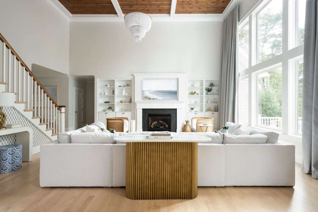
Incorporating color as a backdrop for stunning lighting fixtures or exposed wooden beams can further elevate your ceiling design. Colorful ceilings can make chandeliers, pendant lights, or even recessed lighting pop, turning these functional elements into striking features. Exposed wooden beams, whether they are structural or purely decorative, can benefit from a contrasting ceiling color that highlights their natural beauty and craftsmanship.
These creative treatments showcase the potential of ceilings as more than just a blank canvas. By exploring options like patterned ceiling tiles, shiplap, and strategic use of color with lighting and beams, you can transform your ceiling into an integral part of your interior design. These ideas not only enhance the aesthetic appeal of a space but also inspire a sense of creativity, encouraging you to think beyond the conventional use of paint.
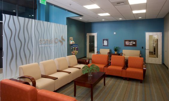
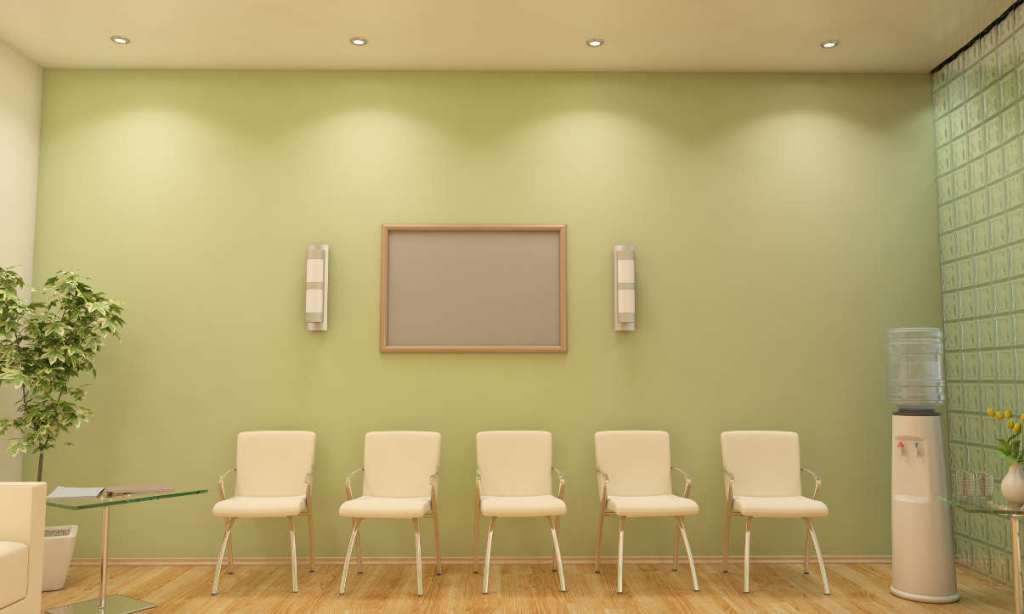
Creating a Welcoming Atmosphere in Doctor’s Offices
Visiting a doctor’s office can often be a daunting experience for many. The sterile and cold environment of these spaces can contribute to feelings of anxiety and discomfort. However, it doesn’t have to be this way. By incorporating thoughtful design elements, such as color, artwork, and comfortable seating, it’s possible to transform these spaces into warm and inviting environments that promote a sense of calm and well-being.
The Impact of Color
Color has a profound effect on our emotions and can significantly influence our mood. In the context of a doctor’s office, opting for calming and soft cheerful colors can help alleviate feelings of stress and apprehension in patients. Studies have shown that the use of soothing colors in healthcare environments can contribute to improved patient outcomes and overall well-being. Soft tones such as pale blues, gentle greens, and warm neutrals can create a sense of tranquility and comfort, making the space more welcoming for patients.
Artwork and Decor
Introducing artwork with a hopeful and uplifting theme can have a positive impact on the atmosphere of a doctor’s office. Inspirational pieces that convey messages of healing, resilience, and positivity can serve as a source of comfort and encouragement for patients during their time in the waiting room. Additionally, the inclusion of artificial plants can bring a touch of nature indoors, adding a refreshing and calming element to the space.
Furthermore, incorporating a statement color, such as a feature wall in a warm and inviting hue, can instantly transform the ambiance of the waiting room. This bold choice can inject personality and vibrancy into the space, setting a welcoming tone for patients as soon as they enter.
Finally, the seating in the waiting room plays a crucial role in ensuring the comfort of patients. Opting for chairs and sofas that are not only aesthetically pleasing but also ergonomically designed can make a significant difference in the overall experience of individuals waiting to see the doctor. Comfortable seating arrangements can help reduce feelings of unease and create a more relaxed environment.
In conclusion, the design of a doctor’s office plays a pivotal role in shaping the experiences of patients. By incorporating elements such as calming colors, uplifting artwork, a statement color, artificial plants, and comfortable seating, it’s possible to create a warm and inviting atmosphere that promotes a sense of ease and well-being for all those who walk through the doors.
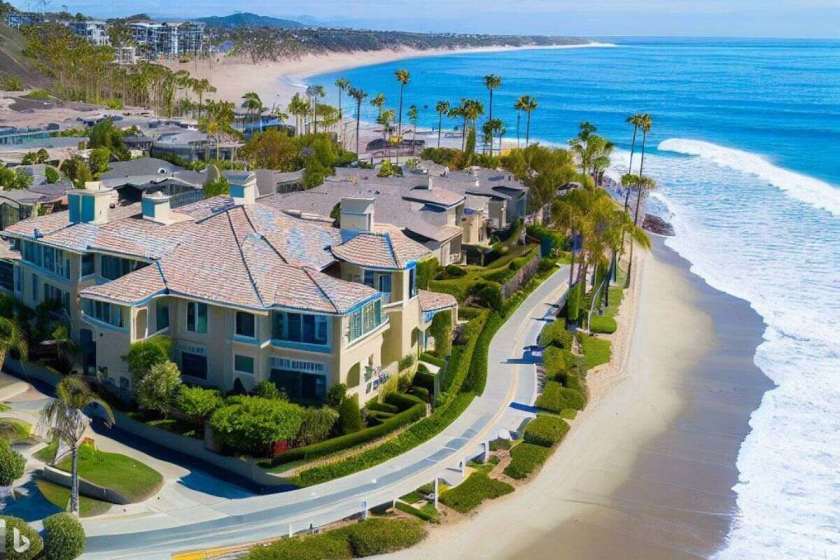
My inspirations come from my clients. My client yesterday wanted her home out here to feel more like here home on the east coast. How about you? Are you dreaming of a coastal retreat right in the comfort of your own home? With a few simple design choices, you can transform any space into a serene oasis that captures the essence of beach living. In this blog post, we will explore some tips and tricks for creating a coastal vibe that will transport you to the seaside, even if you’re miles away.
Maintaining an Airy Feel
The key to achieving a coastal vibe is to create an airy and light-filled space. Start by using a very light shade base for your walls, which will give the room a fresh and clean look. To add a touch of the ocean, this shade should incorporate hints of blue or green. You can expand on this through accessories such as throw pillows, curtains, or artwork. By using these hushed tones, you will create a calming and soothing atmosphere that mimics the colors of the sea.
Adding Accent Walls
To further enhance the coastal feel, consider adding accent walls in slightly deeper blues or greens, keeping them in soft muted tones. This can be achieved by using paint, wallpaper (in solid colors or patterns), or even textured wall panels. The accent wall will serve as a focal point in the room and will instantly transport you to a beachside paradise. Choose colors that complement the rest of the space and create a cohesive look.
Bringing in Beach Textures
To truly capture the essence of coastal living, incorporate beach textures into your home. One way to achieve this is by opting for worn wood vinyl flooring, or distressed wooden pieces. This type of flooring mimics the look of weathered wood found on the beach and adds a rustic touch to the space. Pair it with cream or sand-colored cabinets and shelving to create a cohesive and beach-inspired look.
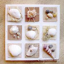
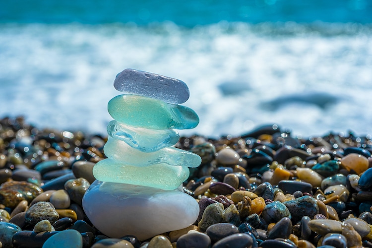
Sea Glass and Shell Accents
No coastal-inspired space is complete without sea glass and shell accents. Incorporate these elements into your decor by using tiles with sea glass or shell patterns in your bathroom or kitchen. You can also display sea glass and shells in clear jars or bowls as decorative accents throughout your home. These small touches will add a touch of the beach to your space and create a sense of tranquility.
Creating a coastal vibe in your home is all about capturing the essence of the beach and bringing it indoors. By maintaining an airy feel, adding accent walls in muted tones, bringing in beach textures, and incorporating sea glass and shell accents, you can transform any space into a coastal retreat. So go ahead, embrace the coastal lifestyle and create your own little piece of paradise. And when you can, get to the actual beach and enjoy the sand under your toes!!
From Beige to White: Adding Warmth and Style to Your Home
Are you tired of the dull and lifeless beige walls in your home? Do you want to create a fresh and inviting space without making it feel sterile? Look no further than the timeless elegance of white walls. Whether you prefer warm whites or cool whites, this versatile color can transform your home into a modern and refreshing sanctuary.
Choosing the Right Shade of White
When it comes to white walls, there are countless shades to choose from. Warm whites, with their undertones of cream or beige, can add a cozy and inviting atmosphere to any room. On the other hand, cool whites, with hints of blue or gray, can create a modern and clean aesthetic. The key is to find the perfect balance that suits your personal style and complements your existing decor.
Using White as a Canvas
One of the greatest advantages of white walls is the endless possibilities they offer for adding accents and personal touches. By using white as a base, you can easily incorporate pops of color, patterns, and textures to create a unique and personalized space. Whether you prefer a modern farmhouse look or an airy boho style, white walls provide the perfect backdrop for your creativity to shine.
For a modern farmhouse vibe, consider pairing your white walls with rustic wooden furniture, vintage accessories, and cozy textiles. This combination creates a warm and inviting atmosphere that is both timeless and on-trend. On the other hand, if you’re drawn to the airy boho style, combine your white walls with natural materials, such as rattan or jute, and add pops of greenery for a fresh and organic feel.
Popular White Paint Brands
When it comes to choosing the perfect shade of white, there are a few popular paint brands that are known for their quality and extensive range of white hues. Dunn Edwards and Sherwin Williams are two such brands that offer a wide selection of whites to suit every taste and style. From warm off-whites to cool crisp whites, these brands have you covered.
Remember, when selecting a white paint, it’s essential to test it in different lighting conditions and against your existing decor. The right shade of white can make all the difference in creating the desired atmosphere and ambiance in your home.
In conclusion, transitioning from beige to white walls can breathe new life into your home. Whether you opt for warm or cool whites, white walls provide a blank canvas for your creativity to flourish. With the right accents and personal touches, you can transform your space into a modern and inviting sanctuary. So, why wait? Embrace the beauty of white and embark on a journey of style and warmth.
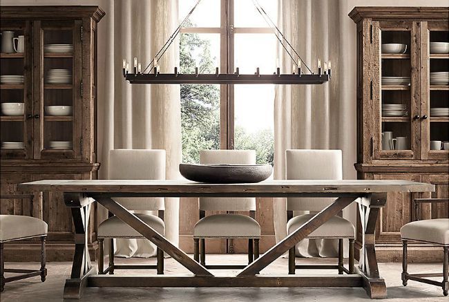
Creating a Restoration Hardware-Inspired Color Palette
When it comes to interior design, Restoration Hardware is known for its elegant and timeless aesthetic. The brand’s color palettes and design choices have become a popular source of inspiration for many homeowners and designers alike. If you’re looking to achieve a similar look for your space, here are some tips on creating a Restoration Hardware-inspired color palette.
1. Warm Neutrals
Restoration Hardware is known for its use of warm neutrals, such as beige, cream, and taupe. These colors create a sense of warmth and coziness in a space, making it inviting and comfortable. Consider using these warm neutrals as the base colors for your color palette.
2. Bronzed Metallics
To add a touch of luxury and sophistication to your space, incorporate bronzed metallics into your color palette. Brass, copper, and bronze accents can be used in lighting fixtures, hardware, and decorative accessories. These metallics add a subtle sheen and richness to the overall design.
3. Simple Lines and Materials
When it comes to furniture and decor, Restoration Hardware favors simple lines and materials. Look for pieces that have clean and minimalistic designs, such as streamlined sofas, sleek dining tables, and understated accessories. Materials like wood, linen, and leather are commonly used by the brand and can help you achieve that timeless and classic look.
Affordable Textures
While Restoration Hardware is known for its high-end products, you don’t have to break the bank to achieve a similar look. Look for affordable alternatives that mimic the textures used by the brand. For example, instead of investing in a genuine leather sofa, consider a high-quality faux leather option. Look for affordable linen curtains or textured wallpaper to add depth and interest to your space.
Remember, creating a Restoration Hardware-inspired color palette is all about capturing the essence of the brand’s design aesthetic. By using warm neutrals, incorporating bronzed metallics, opting for simple lines and materials, and finding affordable textures, you can achieve a similar look and feel in your own home. So go ahead and get inspired by Restoration Hardware’s timeless and elegant design!
Purple is a captivating color that holds a unique place in the spectrum. It is often associated with royalty, luxury, and power. At the same time, it also evokes a sense of calmness, light-heartedness, and even romance. The varying shades of purple offer different emotions and moods.
The Tranquil and Relaxing Light Purples
Light purples, such as lavender and lilac, have a gentle and soothing effect on our senses. These shades are often associated with tranquility, relaxation, and a peaceful state of mind. They can create a serene atmosphere, making them perfect for bedrooms, meditation spaces, or any area where you want to unwind and de-stress.
When using light purples in your home decor, you can create a sense of calmness and tranquility. Soft purple accents in pillows, curtains, or wall art can add a touch of elegance and serenity to any room. Pairing light purples with neutrals, such as whites or grays, can enhance their relaxing effect.
The Luxury of Dark or Intense Purples
On the other end of the spectrum, dark or intense purples, such as plum or eggplant, exude a sense of luxury and opulence. These deep shades are often associated with power, wealth, and extravagance. They can add a touch of sophistication and drama to any space.
Dark purples can be used as accent colors to create a bold and luxurious statement. A deep purple accent wall or a plush velvet purple sofa can instantly elevate the ambiance of a room. Pairing dark purples with metallic accents, such as gold or silver, can enhance their regal and luxurious feel.
Combining the Two Sides of Purple
When it comes to incorporating purple into your decor, you can choose to embrace either the tranquil light purples or the luxurious dark purples. However, you can also create a harmonious balance by combining both sides of purple.
For example, you can use light purples as the base color and add pops of dark purple accents to create a striking contrast. This combination can create a sense of depth and richness in your space. Alternatively, you can use dark purples as the dominant color and incorporate light purple elements to soften the overall look.
Remember, the key is to find the right balance that suits your personal style and the atmosphere you want to create. Whether you choose to embrace the royalty and luxury of dark purples or the calmness and light-heartedness of light purples, purple is a versatile color that can transform any space into a captivating and enchanting haven.
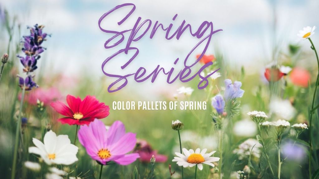
Purples are our last in the Spring Color Series. As with my other pallets these inspiration items can be found on my Amazon Shop page. Up next we we will be diving into new trends for home and garden or I might change it up with tricks to spice up your kitchen. Pun intended 🙂
Orange Symbolizes Joy, Happiness, Energy, and Creativity
Orange is a vibrant and energetic color that is often associated with feelings of joy, happiness, and creativity. It is a color that can evoke a sense of warmth and excitement, making it a popular choice in various settings, including the outdoors, gym, and office/living spaces.
Orange for Outdoors
When we think of the color orange in outdoor settings, we often associate it with the beauty of nature. The warm and inviting hues of orange can be found in stunning sunsets, autumn leaves, and blooming flowers. These natural occurrences of orange can bring a sense of joy and happiness to anyone who appreciates their beauty.
Additionally, the color orange is often used in outdoor recreational spaces, such as patios and pools. This is because orange is known to be an attention-grabbing color that can stimulate energy and excitement. The presence of orange in these areas can enhance the overall experience and create a positive and lively atmosphere.
Need some Motivation?
Orange is a popular color in gym settings due to its association with energy and motivation. Many fitness centers incorporate orange into their branding, equipment, and decor to create an environment that inspires and energizes their clients.
Studies have shown that the color orange can increase determination, making it an ideal choice for gym spaces. The presence of orange can help individuals push through their workouts and achieve their fitness goals. Whether it’s the vibrant orange walls, equipment, or motivational quotes displayed in orange, this color can have a positive impact on one’s workout experience.
Orange life in the Office
In office and living spaces, the color orange can promote creativity and productivity. It is believed to stimulate the mind and encourage innovative thinking. Incorporating orange accents, such as furniture, artwork, or accessories, can create a vibrant and stimulating environment.
Furthermore, the color orange is known to enhance social interaction and communication. It can create a warm and inviting atmosphere that encourages collaboration and teamwork. Whether it’s an orange accent wall, decorative elements, or even fresh orange fruit displayed, this color can contribute to a positive and productive work or living environment.
Conclusion
The symbolism of orange as a color of joy, happiness, energy, and creativity is evident in various settings. Whether it’s the natural beauty of orange in outdoor spaces, the motivational impact of orange in the gym, or the stimulating effect of orange in office and living spaces, this color has the power to enhance our experiences and evoke positive emotions. Consider incorporating orange into your surroundings to bring a sense of vibrancy, enthusiasm, and inspiration into your life.
Most of the inspiration items in the above boards can be found in my amazon shop link. They will be available tomorrow 3/29. Hope you will add some energy into your living spaces!!
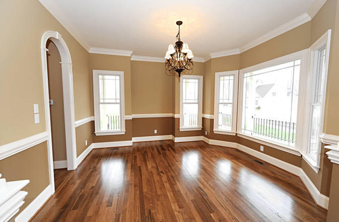
The other day, a friend asked me what my definition of a two toned room is. There are a few different versions out there. Different ways to create, using two colors, using trims or chair rails, adding cutouts etc. Unique styles range from formal and elegant such as in a dedicated dining room or office to adding a bright and fun secondary accent color.
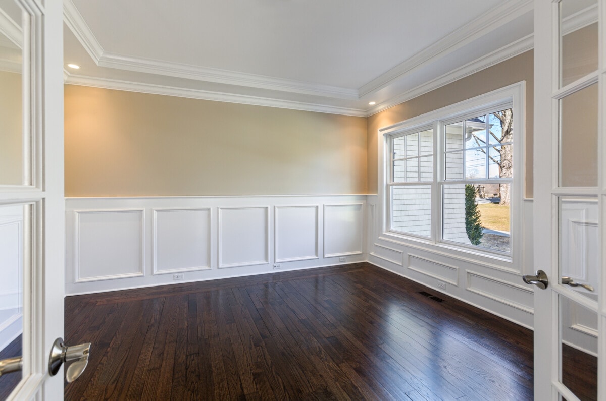
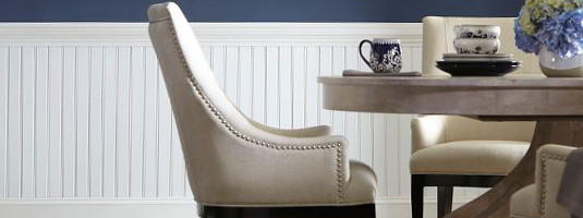
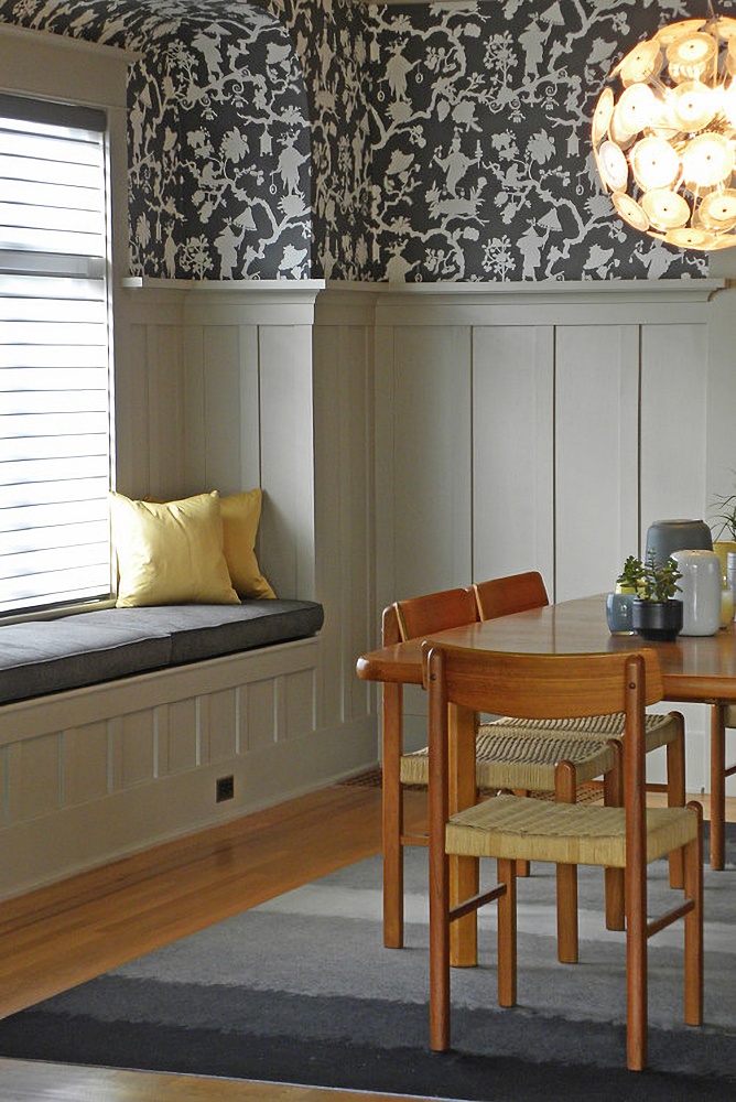
A very simple way to create a two tone room is to divide the walls by using a decorative trim, using two materials for above and below. Usually, the trim is positioned at 1/3 or 2/3 of the room’s height and creates a border. The base can be painted, paneled, dimensioned with picture moldings or even wall papered if so desired. Often times, the trim and base is painted in a bright white, however natural and stained woods can also be used. The function and style of the room will determine the color scheme.
Many clients will choose a neutral color pallet and will pull colors in that same family, working within the different shade levels. To ground rooms while using a chair rail, a mid tone to dark rich color is chosen for the base. The upper color is one to three shades lighter than the base, essentially moving up the color card. As you can see in this room, there are two shades difference between base and upper walls.
Moldings can be added to the base in many different styles. They can be painted white, accented picture framed, paneled and even use wainscoting. Here are a few examples.
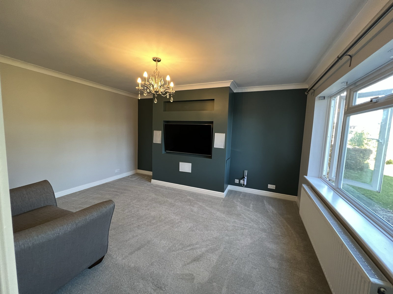
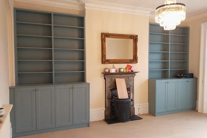
Sometimes, builders will create cutouts or recesses in the walls that can become perfect opportunities to two tone. Alcoves, tv or fireplace recess can be different color paint or can be enclosed by cabinetry giving off two tone looks.
Believ it or not, wall paper is making a comeback. There are a variety of styles from full floor to ceiling prints, half wall murals and accent images, some can even be custom printed. Advancements with wallpaper include less surface prep as adhesives are better, they are easier to work with for the everyday home owner, and some are peelable and removable if a client is in a temporary living situation such as in an apartment. Below are some examples.
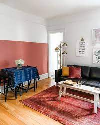
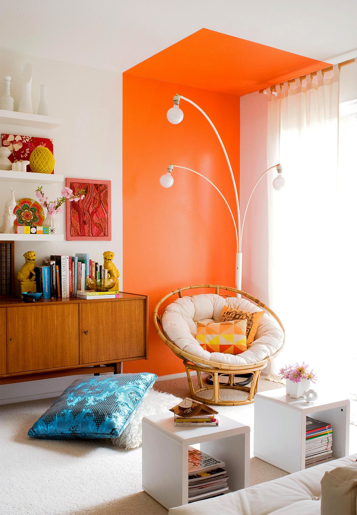
Two toned in its most basic form is creating a divide with the use of color. It is not limited to dividing horizontally as you can also vertically divide a space, I personally am a fan of contrast and bright, intense colors. You can see in these images how a simple clean line of paint transforms a room.
I know that there are more ways out there to create a unique two toned design. I do hope however that this brief post will help get your ideas going. Change up the look of your room or your hallway, add in that divider or wallpaper. I hope that as I continue to help customers color their walls I will have examples of my work posted here for you to enjoy. In the mean time, don’t be afraid to experiment, Distracted Damsel signing off.