Let’s be honest—transforming a home can feel a lot. Between Pinterest boards, paint swatches, and all the “what ifs,” it’s easy to end up overwhelmed before you even begin.
But here’s the truth: you don’t have to do it all at once.
In fact, taking it one step at a time is not only okay—it’s smart. Whether you’re working with a full-house refresh or just trying to make a few rooms feel more “you,” breaking things down into manageable steps can save your sanity (and your budget).
Start with What Matters Most
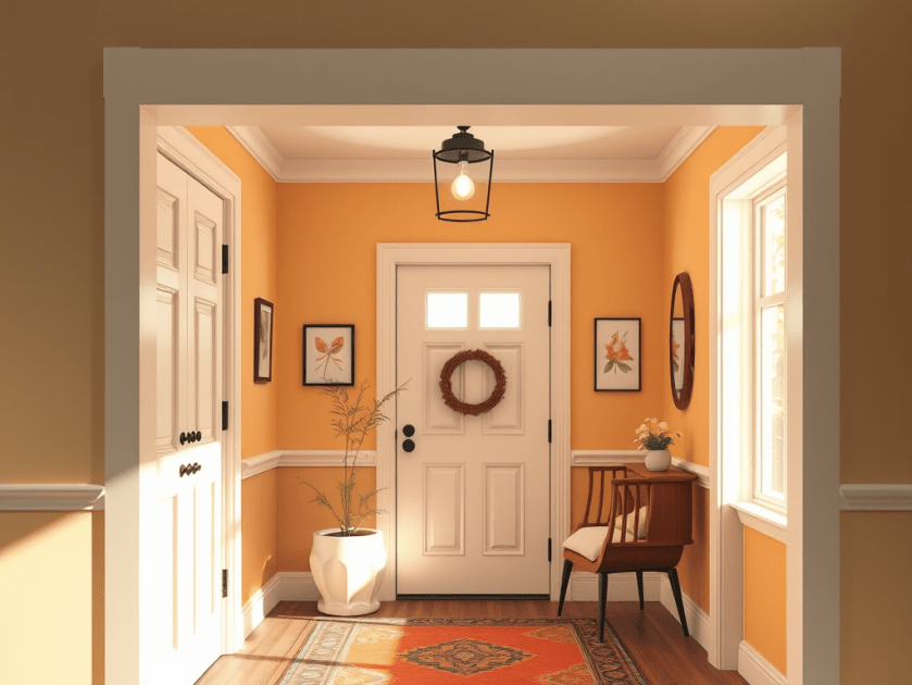
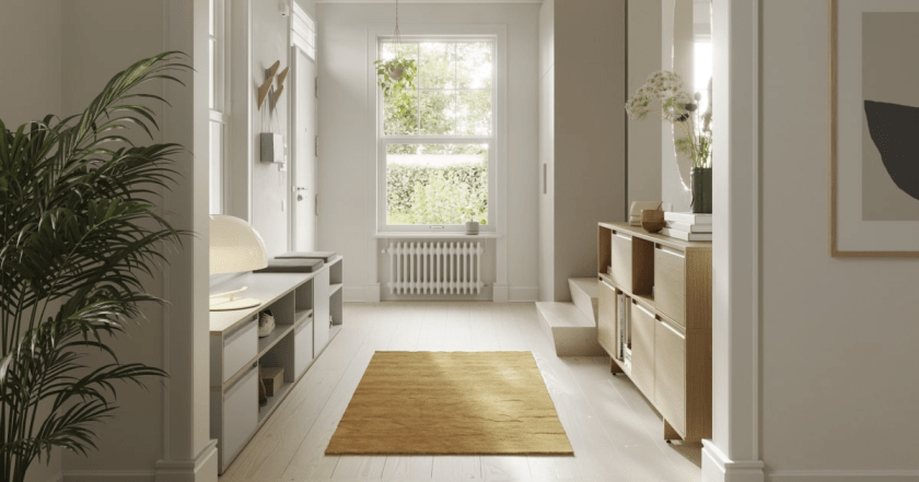
Instead of tackling the entire house in one go, focus on the areas that will make the biggest difference right away—think the entryway, living room, or kitchen. These are the spaces guests see first, but more importantly, they’re the ones you walk through every single day.
A fresh coat of paint in the entry or some updated lighting in the kitchen can make your whole home feel different—without touching every single room.
Room by Room, Floor by Floor
There’s no rule that says everything has to be done at once or even all in the same week (or month, or year!).
You might choose to move floor by floor—starting downstairs where the most traffic happens and working your way up when the time, budget, or energy allows. Even if you’re planning to use the same paint color throughout the house, it’s okay to spread it out.
Or maybe it makes more sense to go room by room. Especially if you’re still figuring out how each space will be used. Is that spare room going to be a guest room? A home office? A playroom? Taking your time gives you room to decide.
Make It Personal (and Functional)
The best transformations aren’t just pretty—they work for the people who live there. Before you commit to any big changes, think about the purpose of each room.
Who uses the space? What do you need it to do? What vibe are you going for?
Taking a beat to figure those things out will help you make choices you won’t regret later. Rushing into a design without a clear vision is often what leads to “I wish I had done it differently.”
Progress Is Still Progress
Remember: Rome wasn’t built in a day.
There’s absolutely no shame in doing things slowly. In fact, it often leads to better, more thoughtful results. Taking your time means you can make decisions with confidence, spread out expenses, and enjoy each win as it comes.
So if your home doesn’t feel “done” yet, that’s okay. It’s a work in progress—just like all the best things are.
Want help figuring out where to start? Let’s break it down together. Sometimes all you need is a plan—and a little color guidance. 🎨
When it comes to cabinetry, wood and stained finishes are like the classic hits of interior design—always in style and forever chic. Imagine the natural beauty of wood grains and the rich, deep hues of stains transforming your kitchen or bathroom into a cozy, inviting oasis. Whether you’re vibing with the light charm of oak or the luxurious depth of mahogany, wood and stained cabinetry are design staples that’ll never go out of fashion.
Classic Whites and Creams
Whites and creams are the ultimate design superheroes—simple, elegant, and versatile. These colors offer a clean canvas, letting other elements of your room steal the spotlight. Perfect for lovers of timeless design, white and cream cabinetry can make any space feel like a breath of fresh air. They’re especially great for smaller spaces, making them look larger and more open. It’s like giving your room a chic makeover that never gets old!
Modern Dark Woods and Bold Colors
For those who crave a sleek, sophisticated vibe, dark woods and bold colors are your go-to. Think deep grays, rich browns, and inky blacks that add a touch of modern elegance to any room. Dark cabinetry makes a powerful statement and pairs beautifully with lighter countertops or backsplashes. It’s all about creating a visually striking contrast that’s both balanced and stylish.
Emerging Trends: Soft Hues
Say hello to the latest trend—soft hues! Gentle blues, serene greens, and dreamy lavenders are making waves in cabinetry design. These colors bring a fresh, calming energy to your space. Don’t shy away from these soothing shades; they can add a unique and tranquil touch to your home. Soft hues are perfect for creating a serene and welcoming atmosphere that feels like a gentle hug.
Bright and Bold: Making a Statement
Ready to make a splash? Bright colors are fantastic for adding personality and flair to playrooms, functional spaces, or bold modern designs. These vibrant hues reflect a unique taste and make a memorable statement. Just be sure to balance them with lighter elements—like glass doors or white accents—to keep the space from feeling too overwhelming. If you’ve got a favorite color, let it shine through your cabinetry design!
Endless Color Options
In the world of cabinetry, the color possibilities are as vast as your imagination. Whether you’re drawn to the timeless charm of white farmhouse styles or the eye-catching impact of a vibrant hue, there’s a perfect cabinetry color out there for everyone. The secret? Choose a color that resonates with your personality and complements your space’s overall vibe. It’s your home—make it as colorful and fabulous as you are!
Colored ceilings play a pivotal role in shaping the mood and perception of space within a room. A well-chosen ceiling color can dramatically alter the ambiance, adding a unique dimension to the overall design. Darker ceiling colors, such as deep blues or rich grays, evoke a sense of coziness and intimacy. These colors can create the illusion of a lower ceiling, making a room feel more enclosed and snug. This effect is particularly beneficial in larger living spaces or bedrooms where a more intimate setting is desired.
Conversely, lighter ceiling colors, including soft whites or pastel shades, contribute to a feeling of expansiveness and airiness. These hues can visually lift the ceiling height, opening up the space and making it appear larger and more inviting. This approach is especially effective in smaller rooms or areas that lack natural light, such as kitchens or bathrooms. By choosing light, reflective colors, the ceiling can help bounce light around the room, enhancing brightness and a sense of space.
The selection of ceiling color should be thoughtfully considered in relation to the room’s function and the desired ambiance. For instance, in a living room, a warm, inviting color on the ceiling can create a welcoming atmosphere, while a light, airy color might be more suitable for a kitchen where cleanliness and openness are paramount. Bedrooms, often a sanctuary for rest and relaxation, benefit from calming, subdued ceiling colors that promote tranquility.
Different color choices can transform the atmosphere of various types of rooms. Experimenting with ceiling colors allows homeowners and designers to craft spaces that not only meet functional needs but also enhance aesthetic appeal. Whether aiming for a cozy retreat or an open, airy environment, the ceiling’s color can be a powerful tool in achieving the desired ambiance. This nuanced approach to color application underscores the importance of viewing the ceiling as a critical element in interior design.
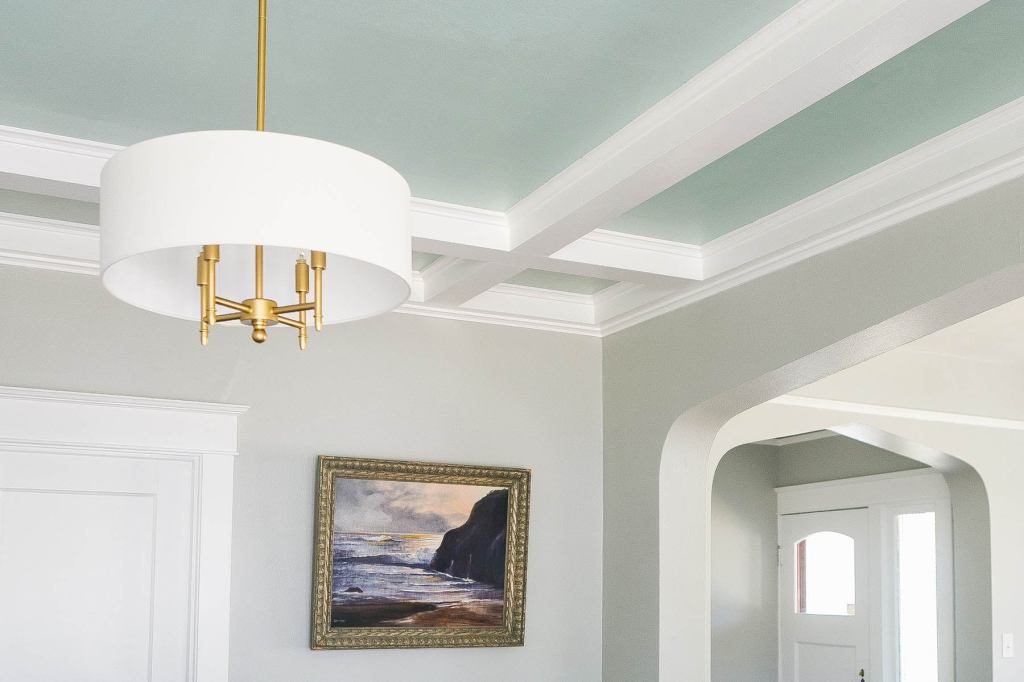
Coordinating Ceiling Colors with Furniture and Decor
Choosing the right ceiling color to complement or coordinate with your furniture and decor is essential for creating a harmonious and cohesive design. The ceiling, often referred to as the “fifth wall,” plays a pivotal role in the overall aesthetic of a room. By carefully selecting a ceiling color that either matches or accentuates the existing elements, you can significantly enhance your space.
One effective approach is to use color theory as a guide. Understanding the relationships between colors on the color wheel can help you make informed decisions. For instance, complementary colors—those directly opposite each other on the color wheel—can create a dynamic and balanced look. If your room features a lot of blue tones, a soft orange ceiling might provide a beautiful contrast while maintaining harmony. Conversely, analogous colors, which are next to each other on the color wheel, offer a more subtle and cohesive look. Pairing a green ceiling with blue and teal decor can create a serene and unified space.
Contrast is another critical factor to consider. A bold ceiling color can serve as an accent that ties together various decor items or furniture pieces. For example, a deep navy ceiling in a room with white walls and dark wood furniture can create a striking focal point, adding depth and sophistication. On the other hand, a more neutral ceiling, such as a soft gray or beige, can provide a subtle backdrop that enhances the overall aesthetic without overpowering the space. This approach works particularly well in rooms with vibrant or patterned decor, as it allows the other elements to shine.
Creating visual balance is key to a well-coordinated space. If you opt for a bold ceiling color, it is crucial to balance it with other elements in the room. This can be achieved by incorporating accessories, textiles, or artwork that echo the ceiling color. For instance, if you choose a rich green ceiling, adding green throw pillows, rugs, or wall art can help create a cohesive look. Conversely, a neutral ceiling gives you more flexibility to experiment with colorful decor items and furniture without overwhelming the room.
In summary, coordinating ceiling colors with furniture and decor involves a careful balance of color theory, contrast, and visual balance. By considering these factors, you can create a space that is both visually appealing and harmonious, transforming your room from above.
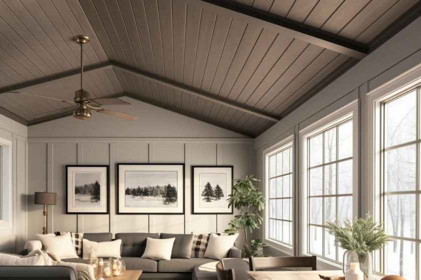
Beyond Paint: Creative Ceiling Treatments
When considering how to transform your space from above, the use of color on ceilings extends far beyond traditional paint. Creative ceiling treatments can redefine a room, adding texture, dimension, and a unique focal point. One such innovative approach is the use of patterned ceiling tiles. These tiles come in a myriad of designs, from intricate floral motifs to geometric patterns, offering a sophisticated touch that paint alone cannot achieve. Patterned ceiling tiles can introduce a sense of elegance and visual interest, making them an excellent choice for spaces that aim to impress.
Another compelling option is shiplap, which brings a rustic charm and depth to any room. This wooden board treatment, commonly used in farmhouse and coastal designs, adds warmth and character through its natural texture. Shiplap can be painted in a variety of colors to match your decor, or left in its natural state for a more organic feel. The horizontal lines of shiplap also draw the eye across the ceiling, enhancing the perception of space and making rooms feel larger and more open.
Incorporating color as a backdrop for stunning lighting fixtures or exposed wooden beams can further elevate your ceiling design. Colorful ceilings can make chandeliers, pendant lights, or even recessed lighting pop, turning these functional elements into striking features. Exposed wooden beams, whether they are structural or purely decorative, can benefit from a contrasting ceiling color that highlights their natural beauty and craftsmanship.
These creative treatments showcase the potential of ceilings as more than just a blank canvas. By exploring options like patterned ceiling tiles, shiplap, and strategic use of color with lighting and beams, you can transform your ceiling into an integral part of your interior design. These ideas not only enhance the aesthetic appeal of a space but also inspire a sense of creativity, encouraging you to think beyond the conventional use of paint.
Choosing the right wallpaper can transform any room in your home, but with so many options available, it can be overwhelming to decide what fits best. Whether you’re looking to create an accent wall, establish a theme, or make a bold statement, this guide will help you make an informed decision. Let’s dive into some practical tips to assist you in selecting the perfect wallpaper.
Accent Walls: Subtle Yet Impactful
If you’re considering an accent wall, you’re aiming to highlight a specific part of the room without overwhelming the entire space. Accent walls are perfect for hanging art or adding shelves, so choosing a patterned or textured wallpaper is ideal. Patterns like geometric shapes or subtle textures can provide a versatile backdrop that complements various decor items, giving you the flexibility to change up the room’s look without replacing the wallpaper.
Themed Walls: Bringing Cohesion to Your Space
Themed walls are a great way to bring a sense of unity to a room. Themes could range from classic stripes and floral patterns to more specific designs like kitchen utensils in the kitchen or soap bubbles in the laundry room. When choosing a theme, think about what makes you happy and how you want the room to feel. Themed wallpaper can create a cozy, cohesive atmosphere that reflects your personality and style.
Statement Walls: Bold and Beautiful
For those who love to make a dramatic impact, a statement wall is the way to go. Statement walls can be created using wallpaper murals, vibrant patterns, or pops of color and shapes. These are perfect for adding a focal point to a room and can be a great conversation starter. However, due to their bold nature, it’s essential to ensure the design complements the rest of the room’s decor.
Practical Tips for Choosing Wallpaper
Most wallpaper options can be ordered and found online, making it easier than ever to browse different styles and designs. Before you make a purchase, consider your DIY skills. Some wallpapers, especially one-run murals, require precision and leave little room for error. If you’re not confident in your ability to hang the wallpaper yourself, it might be worth seeking professional help to ensure a flawless installation.
Have Fun with Your Choice
Remember, choosing wallpaper should be a fun and creative process. Don’t be afraid to experiment with different patterns and colors until you find what truly speaks to you. After all, your home is a reflection of your personality, so let it shine through in your choice of wallpaper.
One of the key elements to creating a light and airy master bath is to make the most of the natural light you already have. If your bathroom has windows, consider using sheer curtains or blinds that allow light to filter through while still providing privacy. Natural light can make a space feel larger and more inviting, so don’t block it out.
Incorporate Cool Lighting Hues
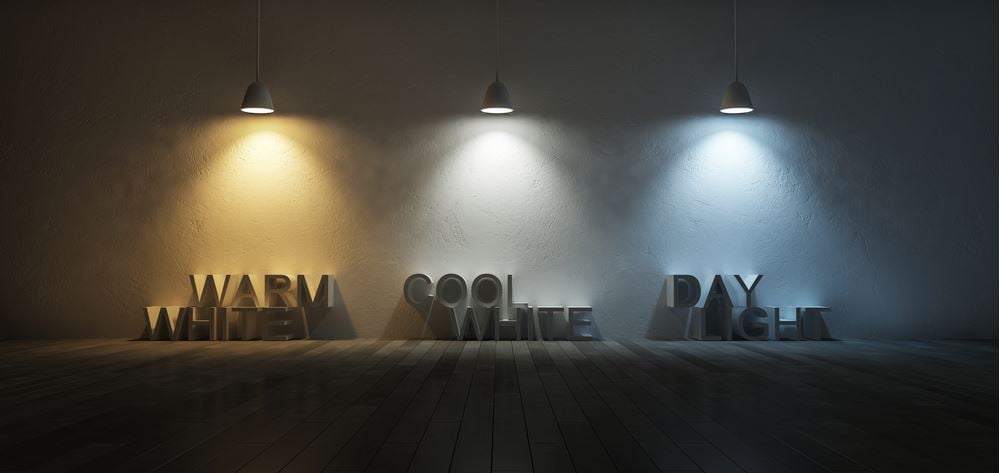
In addition to natural light, incorporate cool lighting hues with your fixtures. Opt for LED bulbs that emit a soft, white light rather than harsh, yellow tones. This will help to enhance the airy feel of your bathroom. Fixtures in chrome or brushed nickel can also reflect light and add to the overall brightness.
Add Mirrors
Mirrors are an excellent way to make any space feel larger and more open. In a master bath, consider adding a large mirror above the vanity or even a full-length mirror on one wall. Mirrors reflect light and give the illusion of more space, making your bathroom feel airy and light.
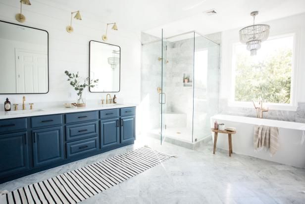
Choose Simple, Free-Standing Tubs
To avoid making the space feel heavy, opt for simple, free-standing tubs. These tubs take up less visual space and keep the bathroom feeling open and uncluttered. They also add a touch of elegance and sophistication to the room.
Go for Neutral, Light Colors
When it comes to color schemes, neutral and light colors are your best friends. Whites are clean and bright, making the space feel fresh. Greens and blues are calming and give off a spa-like vibe. Stick to these colors for walls, tiles, and even towels to maintain a cohesive and airy look.
Consider Cabinet Size and Quantity
The size and quantity of cabinets can greatly affect the feel of your master bath. Floating cabinets or cabinets with feet will feel lighter and less bulky. For a brightening effect, choose white cabinets. If you prefer a bit of contrast, go for deep colors such as navy, ash, or black. This can add depth without compromising the light and airy feel.
Final Touches
Finally, add some finishing touches to complete the look. Plants, for example, can add a touch of nature and freshness to your bathroom. A well-placed rug or a set of plush towels can also enhance the cozy, spa-like atmosphere you’re aiming for.
By following these tips, you can create a master bath that is not only light and airy but also a relaxing oasis where you can unwind and rejuvenate.
Utilizing Existing Base Colors and Adding Secondary Colors for Different Zones
When considering repainting your home, it’s essential to recognize that you don’t need to update every wall if the color is neutral and the paint is in good shape. A more strategic and often cost effective approach involves keeping the neutral base colors in common areas like living rooms, kitchens, and hallways. This method creates a cohesive and calming environment that enhances the flexibility of your decor and furniture choices. Many times neutral colors, such as beige, gray, or soft whites are found for new construction homes, acting as a versatile canvas, allowing you to easily adapt the space to different styles and trends over time.
Neutral base colors in common areas help in establishing a unified look throughout your home. These shades serve as a backdrop, seamlessly connecting different spaces and providing a sense of continuity. This consistency makes your home feel more spacious and inviting, as the flow between rooms is less jarring and more harmonious. Additionally, neutral tones are known for their ability to make spaces appear larger and airier, contributing to an overall sense of tranquility.
To add depth and interest, consider employing a secondary base color for specific zones of the house. For instance, you might choose a distinct yet complementary color for hallways, different wings, or upstairs areas. This approach not only saves time and resources but also helps in defining different areas within the home. By using secondary colors strategically, you can create visual boundaries without overwhelming the overall aesthetic. This method allows each zone to maintain its own character while still contributing to the unified look of your home.
In conclusion, the strategic use of neutral base colors in common areas combined with secondary colors for specific zones is an effective way to refresh your home. This approach balances cohesion and individuality, ensuring that your home remains inviting and adaptable. By carefully selecting and applying these colors, you can achieve a harmonious and well-defined living space.
Customizing Rooms and Special Spaces with Unique Colors
When it comes to individualizing spaces within your home, the strategic use of unique colors can make a significant impact. Common areas like living rooms, hallways, and kitchens often benefit from neutral or secondary base colors, creating a cohesive and versatile backdrop. However, personalizing the color schemes in specific rooms can enhance both aesthetics and functionality.
For instance, the master bedroom and bathroom are ideal spaces for personalized color schemes that promote relaxation and retreat. Soft, calming hues such as blues, greens, and lavenders can create a serene atmosphere, making these areas an oasis within your home. These colors can be complemented with neutral undertones to maintain a sense of continuity throughout the house.
In contrast, dining rooms and home offices can be painted with colors that stimulate appetite or boost productivity. Warm tones like rich reds, warm oranges, and deep yellows are known to enhance dining experiences by making the space feel inviting and lively. For home offices, shades of blue and green can foster concentration and reduce stress, creating an environment conducive to productivity.
Children’s rooms, particularly shared spaces like Jack and Jill bedrooms, present another opportunity for creative color use. Maintaining a neutral base color with the addition of an accent wall can strike a balance between playfulness and harmony. Vibrant colors like cheerful yellows, playful pinks, or energetic blues can be used on accent walls or in decorative elements to reflect the personalities and preferences of the young inhabitants, all while ensuring that the overall design remains balanced and cohesive.
This method of customizing rooms with unique colors allows for personal expression while upholding a harmonious flow throughout the entire home. It demonstrates that repainting does not necessitate painting every wall, but rather, making thoughtful color choices that cater to the specific needs and functions of each space.
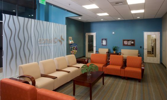
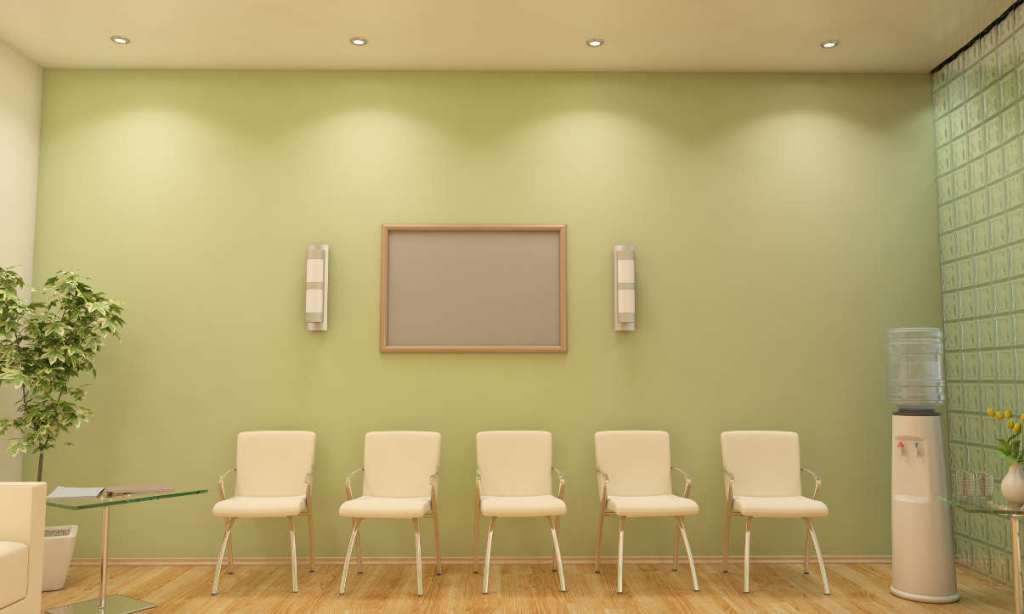
Creating a Welcoming Atmosphere in Doctor’s Offices
Visiting a doctor’s office can often be a daunting experience for many. The sterile and cold environment of these spaces can contribute to feelings of anxiety and discomfort. However, it doesn’t have to be this way. By incorporating thoughtful design elements, such as color, artwork, and comfortable seating, it’s possible to transform these spaces into warm and inviting environments that promote a sense of calm and well-being.
The Impact of Color
Color has a profound effect on our emotions and can significantly influence our mood. In the context of a doctor’s office, opting for calming and soft cheerful colors can help alleviate feelings of stress and apprehension in patients. Studies have shown that the use of soothing colors in healthcare environments can contribute to improved patient outcomes and overall well-being. Soft tones such as pale blues, gentle greens, and warm neutrals can create a sense of tranquility and comfort, making the space more welcoming for patients.
Artwork and Decor
Introducing artwork with a hopeful and uplifting theme can have a positive impact on the atmosphere of a doctor’s office. Inspirational pieces that convey messages of healing, resilience, and positivity can serve as a source of comfort and encouragement for patients during their time in the waiting room. Additionally, the inclusion of artificial plants can bring a touch of nature indoors, adding a refreshing and calming element to the space.
Furthermore, incorporating a statement color, such as a feature wall in a warm and inviting hue, can instantly transform the ambiance of the waiting room. This bold choice can inject personality and vibrancy into the space, setting a welcoming tone for patients as soon as they enter.
Finally, the seating in the waiting room plays a crucial role in ensuring the comfort of patients. Opting for chairs and sofas that are not only aesthetically pleasing but also ergonomically designed can make a significant difference in the overall experience of individuals waiting to see the doctor. Comfortable seating arrangements can help reduce feelings of unease and create a more relaxed environment.
In conclusion, the design of a doctor’s office plays a pivotal role in shaping the experiences of patients. By incorporating elements such as calming colors, uplifting artwork, a statement color, artificial plants, and comfortable seating, it’s possible to create a warm and inviting atmosphere that promotes a sense of ease and well-being for all those who walk through the doors.
This blog is meant to to give you the tools to transform your own home using color. In the realm of interior design, color is a potent tool that can transform spaces, evoke emotions, and reflect your personal style. Whether you’re revamping your home or embarking on a professional design project, understanding the principles of color theory is essential. In this introductory guide, we’ll explore five key points of color theory and their practical applications in interior design, helping you create harmonious, visually stunning spaces.
The Color Wheel: Mapping Out Your Palette: When designing a room, start by selecting a dominant color from the color wheel—this will serve as the foundation for your palette. For example, if you choose a calming blue as your dominant color, you can then use the color wheel to find complementary hues (like soft neutrals or bold oranges) for accents and contrast. By using the color wheel as your guide, you can ensure a cohesive and visually pleasing color scheme throughout the space.
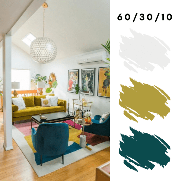
Color Harmony: Balancing Act: Achieving color harmony in interior design involves striking the right balance between different colors and tones within a space. One way to achieve this balance is through the 60-30-10 rule: allocate 60% of the room to a dominant color, 30% to a secondary color, and 10% to an accent color. Applying this principle, you can create a sense of visual cohesion while still incorporating pops of color and interest throughout the room.
Psychology of Color: Setting the Mood: The psychology of color can significantly influence the mood and atmosphere of a room. For instance, warm colors like reds, oranges, and yellows can create a cozy and inviting ambiance in living spaces, while cool tones like blues and greens promote relaxation and tranquility in bedrooms or bathrooms. By understanding the emotional impact of different colors, you can tailor your color choices to suit the function and desired mood of each room.
Color Temperature: Creating Depth and Dimension: Color temperature—whether a color is warm or cool—can affect the perceived size and atmosphere of a room. In smaller spaces, using lighter, cooler colors can help create the illusion of openness and airiness, while warmer hues can make larger rooms feel more intimate and cozy. Experimenting with color temperature allows you to manipulate the visual dynamics of a space and enhance its overall aesthetic appeal.
Color in Practice: Experimenting with Textures and Finishes: In interior design, color isn’t limited to paint swatches and fabric samples—it also extends to textures and finishes. Consider how different materials like wood, metal, and stone interact with color and light in a space. For example, a glossy finish can intensify the richness of a bold color, while a matte finish can soften its impact. By experimenting with textures and finishes, you can add depth and dimension to your design while accentuating the inherent beauty of your chosen color palette.
In the end color theory serves as a guiding principle for creating visually captivating and harmonious interior spaces. By applying the practical insights outlined in this guide—such as using the color wheel to map out your palette, balancing color harmony, leveraging the psychology of color, playing with color temperature, and experimenting with textures and finishes—you can elevate your interior design game and transform any space into a true reflection of your personal style and aesthetic vision. Get started there and me for more!
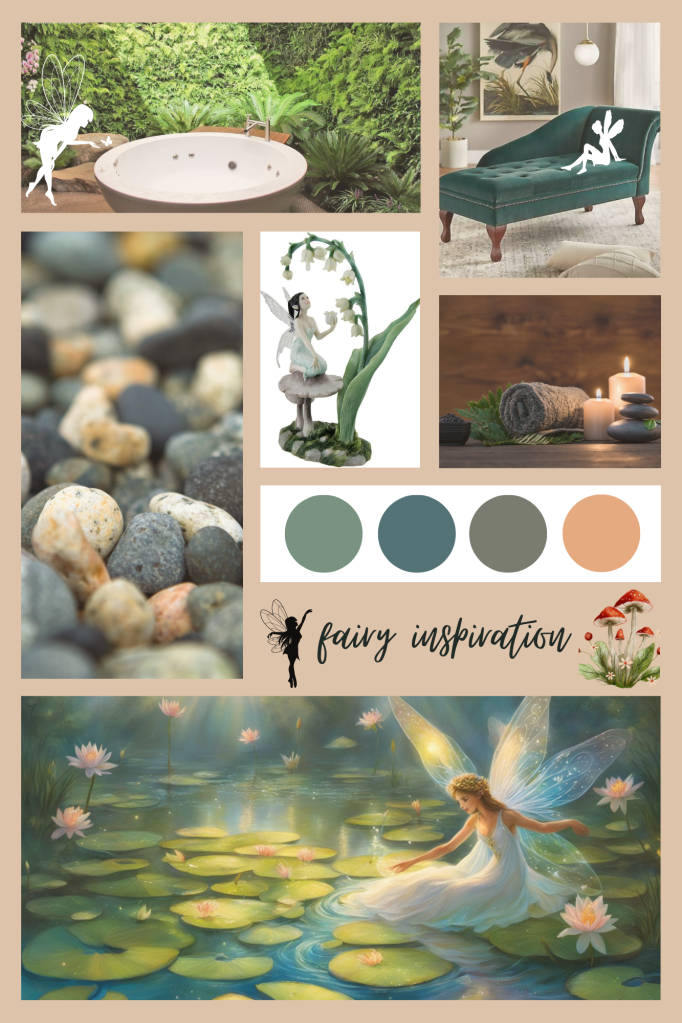
Welcome to the Tranquil Fairy Spa, where zen and beauty come together to create a magical experience. Step into a world of serenity and relaxation, where warm lighting and candlelit ambiance set the mood for a fairy-inspired escape.
Ambiance: Warm Lighting and Fairy Magic
As you enter the spa room, you will be greeted by soft and natural hues that mimic the colors of the sky and trees. Light blues and greens create a tranquil atmosphere, reminiscent of a peaceful forest. The warm lighting and gentle candlelight add a touch of enchantment, making you feel like you’ve entered a fairy realm.
Nature-Inspired Elements: Waterfalls, Forests, and Ferns
Immerse yourself in nature as you indulge in the spa’s luxurious tub or shower area. The tiles surrounding the tub or shower are pebbled, resembling a serene waterfall. To enhance the forest-like ambiance, ferns and willowy plants are strategically placed, creating a lush and calming environment.
Fairy Fun: Unconventional Sinks and Whimsical Decor
For a touch of fairy fun, the Tranquil Fairy Spa features untraditional above counter sinks with pearl or metallic finishes. These sinks not only add a unique and elegant touch but also create a whimsical look that is sure to delight. To further enhance the fairy theme, the spa is adorned with decor featuring fairies and woodland creatures. Twinkle lights add a magical glow, completing the enchanting atmosphere.
Intimate Seating Area: Plush Curtains, Soft Pillows, and Delicate Glassware
After your spa treatment, retreat to the intimate seating area where you can relax and unwind. Plush curtains create a sense of privacy and coziness, while soft pillows provide ultimate comfort. Delicate glassware adds a touch of elegance, making you feel like royalty in your own fairy kingdom.
At the Tranquil Fairy Spa, we believe that beauty and relaxation go hand in hand. With its zen-inspired ambiance, nature-inspired elements, whimsical decor, and intimate seating area, this spa room offers a unique and enchanting experience. So come, escape the hustle and bustle of everyday life, and immerse yourself in the tranquility of the Tranquil Fairy Spa.
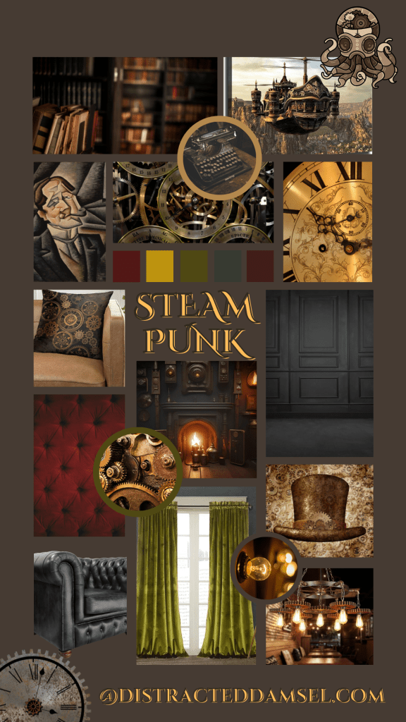
Creating a Steampunk Library: Embracing Rich Colors and Industrial Finishes
Steampunk, a subgenre of science fiction and fantasy, is known for its unique blend of Victorian aesthetics and steam-powered technology. One of the most intriguing aspects of steampunk design is the creation of themed spaces, such as steampunk libraries. In this article, we will explore the key elements and design choices that can help you create a captivating steampunk library.
Embracing Rich Colors and Wood and Metal Finishes
When it comes to the color palette of a steampunk library, rich and dark tones are the way to go. Consider using dark browns, blues, and greys for the walls. Dark paneling or paint can be applied from floor to ceiling to create a sense of depth and richness. These colors provide a perfect backdrop for the steampunk aesthetics.
Wood and metal finishes are essential in steampunk design. Incorporate these materials into the library by using furniture and fixtures with these finishes. For example, consider adding bookshelves made of dark wood with metal accents or a desk with a brass or bronze finish. These elements will help create an authentic steampunk atmosphere.
Industrial Lighting Fixtures and Elegant Furniture
Lighting fixtures play a crucial role in steampunk design. Opt for industrial-style lighting fixtures made of bronze or black metals. These fixtures can be adorned with golden accents to add a touch of elegance. Hang pendant lights or install wall sconces to illuminate the library and enhance the overall steampunk aesthetic.
When it comes to furniture, choose pieces that are both rich and elegant. Steampunk libraries often feature heavier furniture with velvet upholstery. Consider selecting furniture with tufted designs and metal buttons for added sophistication. Rich leathers can also be used to create a luxurious and timeless feel.
Decorative Pieces: Clocks, Gears, and Engines
Decorative pieces are essential in bringing a steampunk library to life. To tie in with the color scheme, incorporate gold, green, and deep purple accents throughout the space. Clocks, gears, and engines are iconic steampunk elements that can be used as decorative pieces. Display vintage clocks on shelves, hang gears on the walls, or even repurpose old machinery as unique focal points.
Additionally, consider incorporating other steampunk-inspired accessories such as magnifying glasses, compasses, or antique globes. These small details will add depth and character to your steampunk library.
Fireplaces as Center Focal Points
A fireplace can become a central focal point in a steampunk library. Choose a fireplace with a heavy and ornate design to match the overall aesthetic. Consider adding decorative elements such as metal candelabras or vintage fireplace tools to enhance the steampunk theme. The fireplace can serve as a statement piece, creating a cozy and inviting atmosphere in your library.
In conclusion, creating a steampunk library involves carefully selecting colors, materials, and decorative elements to achieve a unique and captivating space. Embrace rich colors, wood and metal finishes, industrial lighting fixtures, and elegant furniture. Incorporate decorative pieces that tie in with the steampunk theme, such as clocks, gears, and engines. Finally, consider making the fireplace a center focal point to add warmth and character to your steampunk library.